
As discussed in the NALREA logo post, these 2 were related and he also wanted a very strong graphic design.
Take 1:
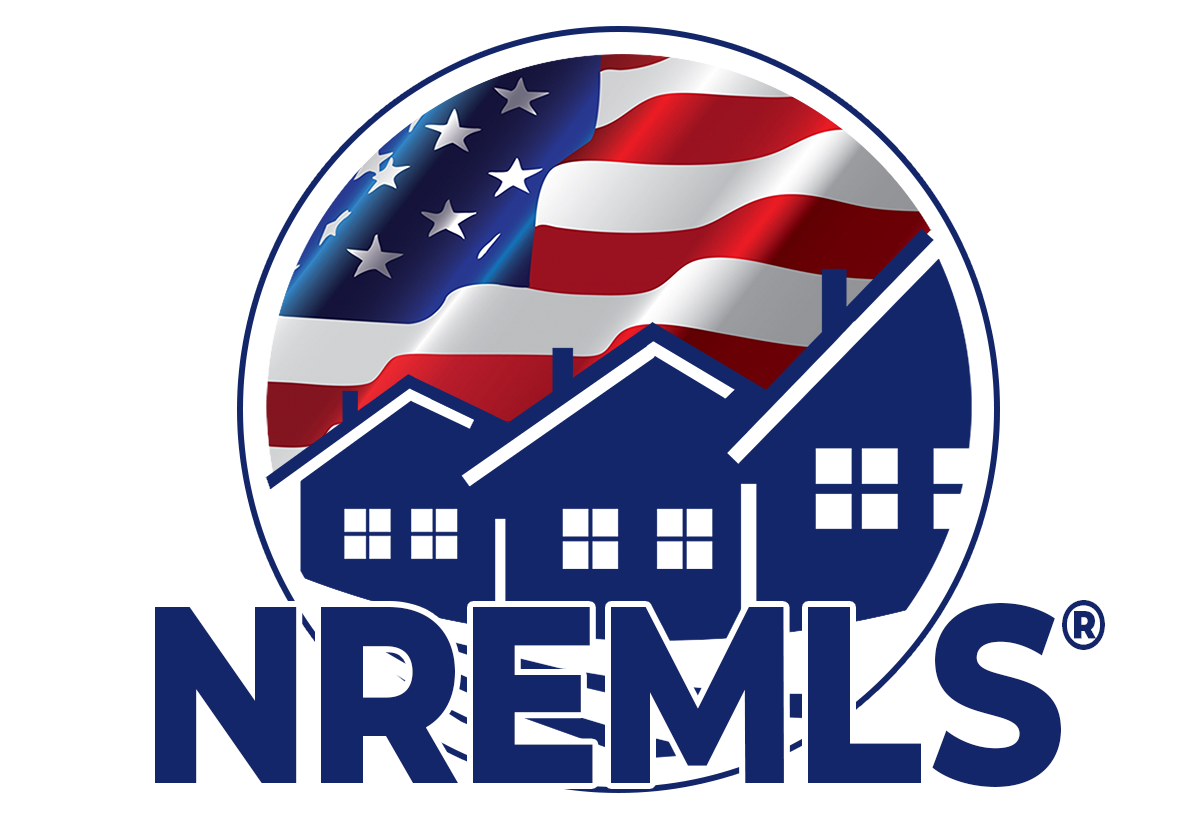
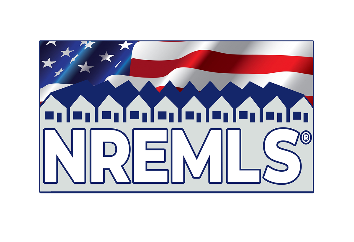
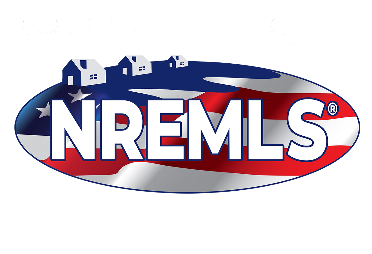


I came up with the circular design and one thing led to another and soon both logos were based on the “seal” design’ There are some interesting things here though I think, very industrial and even reminiscent of communist propaganda posters.
Take 2:


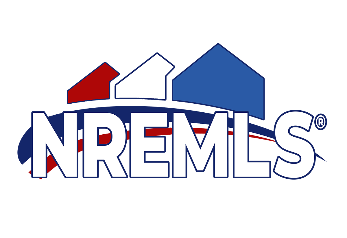
This one came together quickly after that, juxtaposed with the NALREA logo I think they work well together, complementing the other’s design.