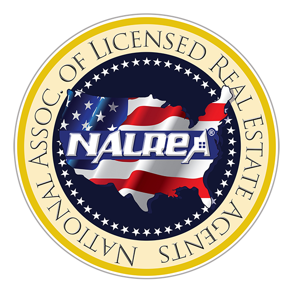
This logo was developed in tandem with the NEMRLS logo, both companies are owned by the same guy and related and he wanted the logos related. They began as typically laid out arrays but when the owner saw the Paradigm logo he wanted a ‘seal’ type logo like that.
Take 1:

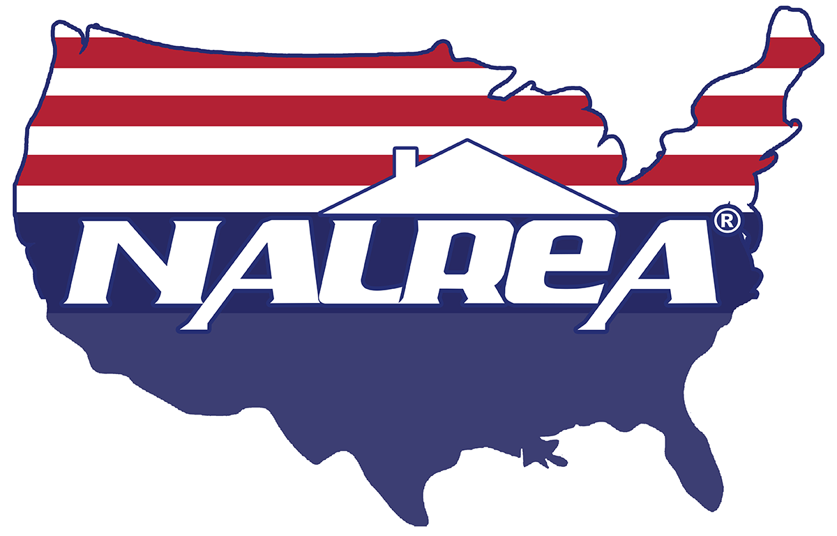
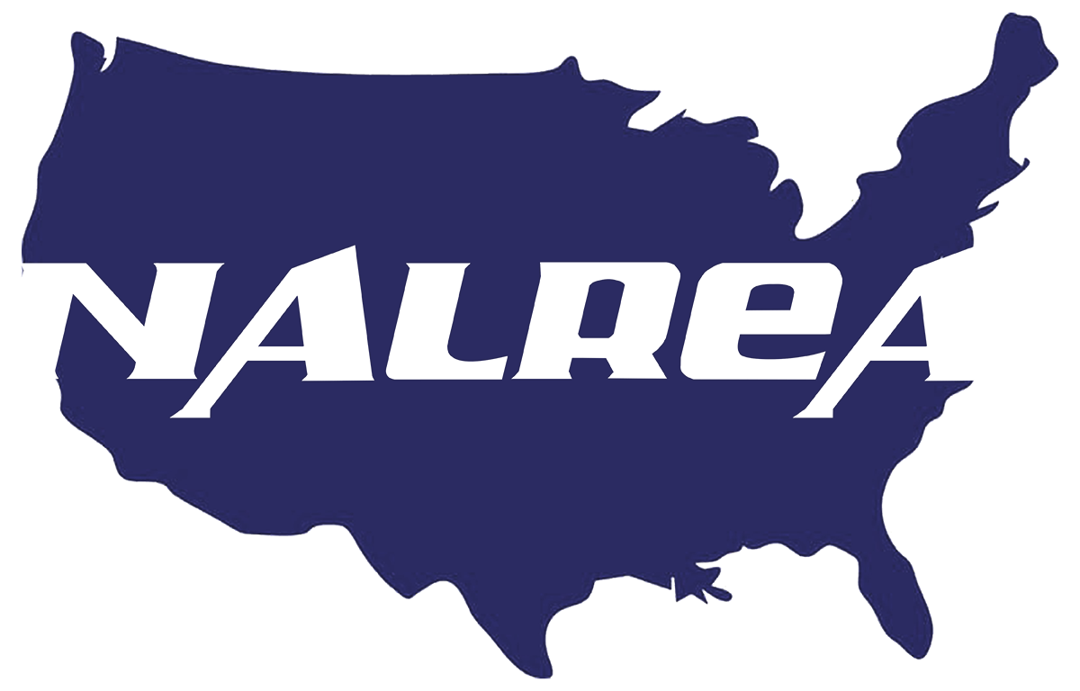
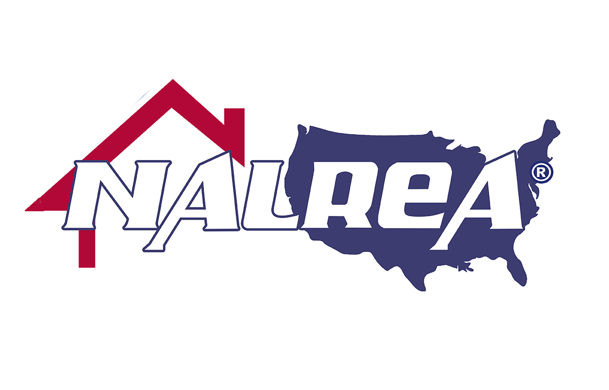
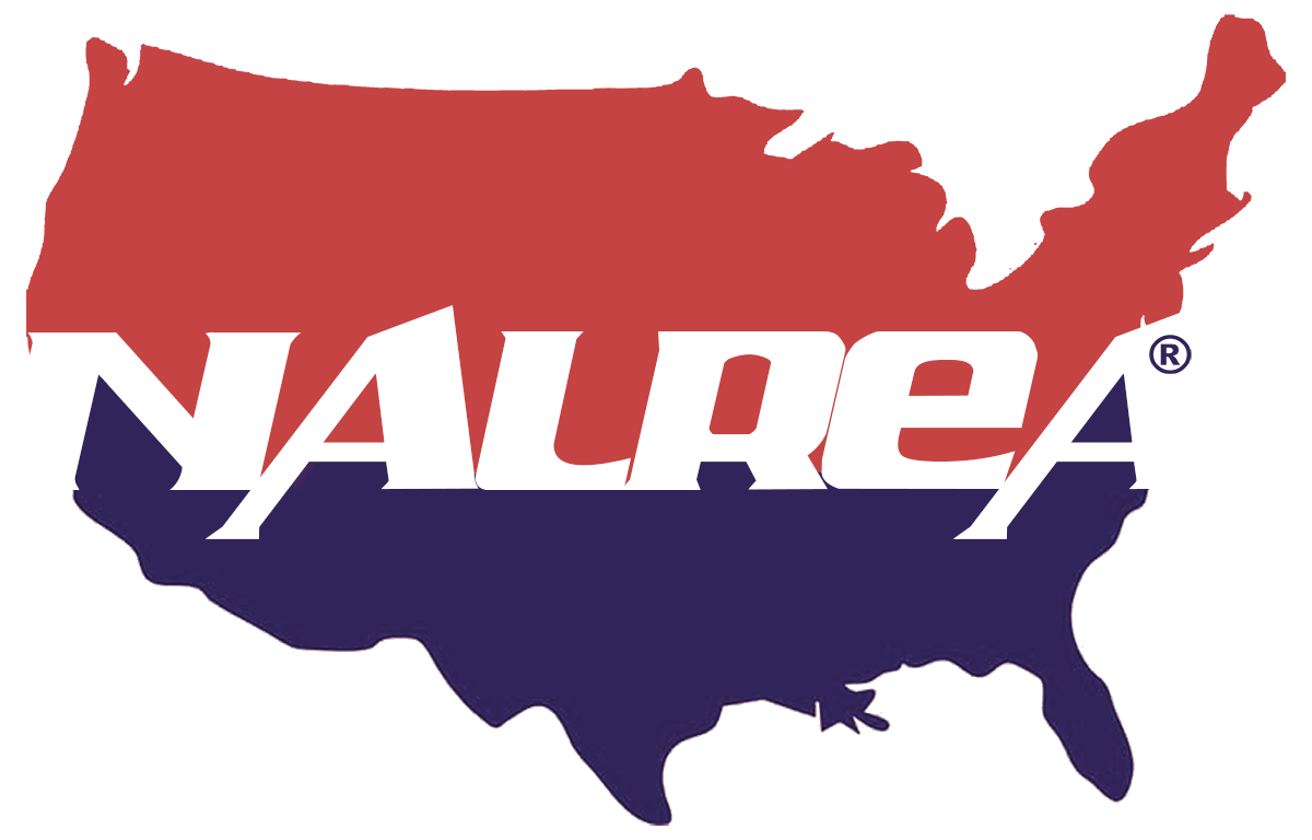
At this point he was only sure he wanted a map of the US to denote it was a national organization and that the colors be red white and blue with strong shades and a strong graphic statement.
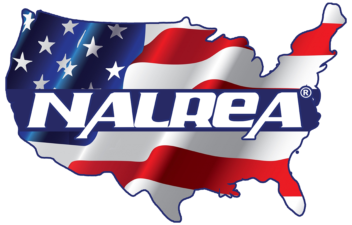
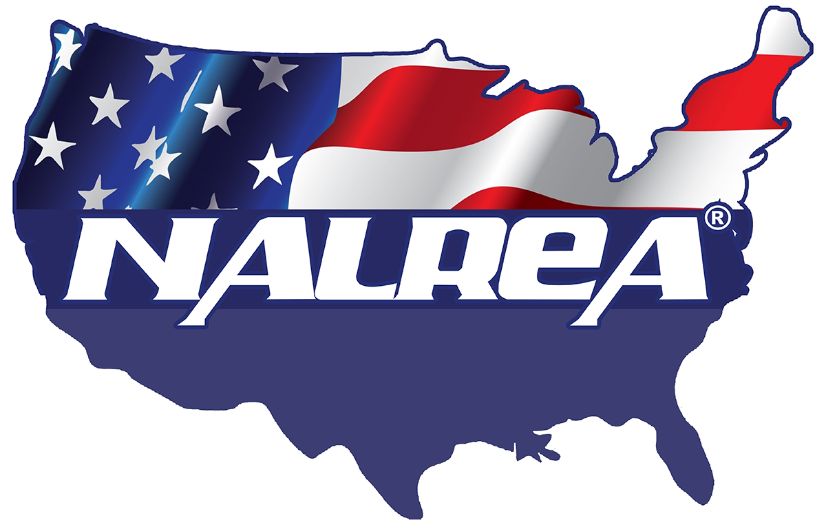
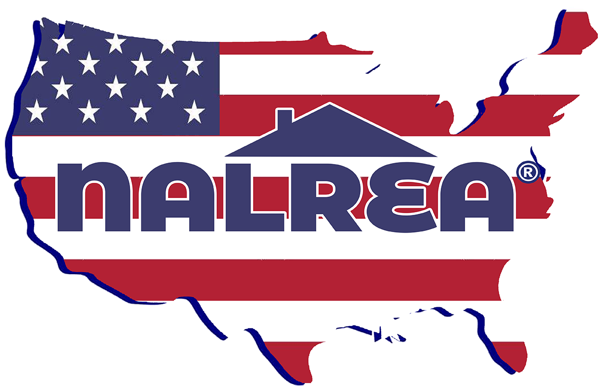
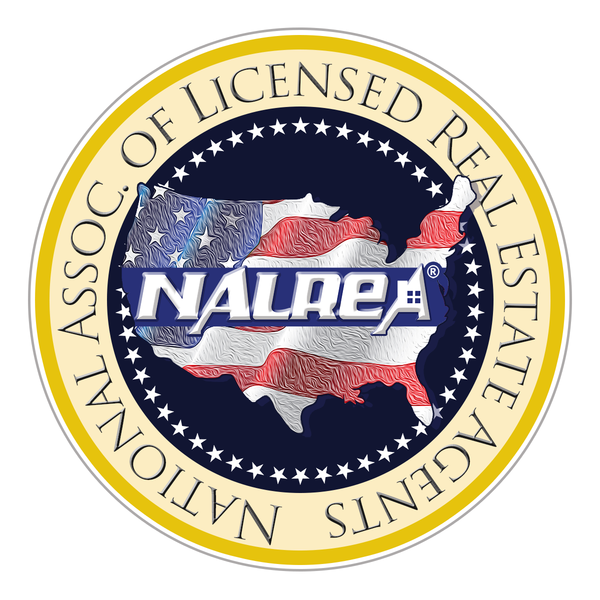
Take 2:
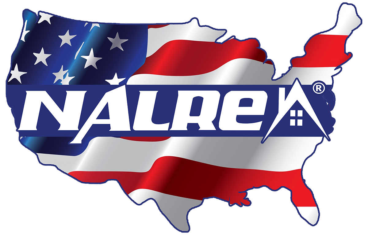

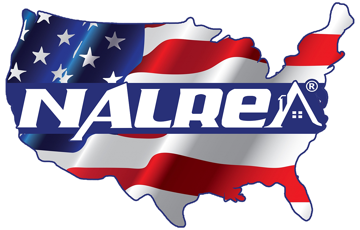

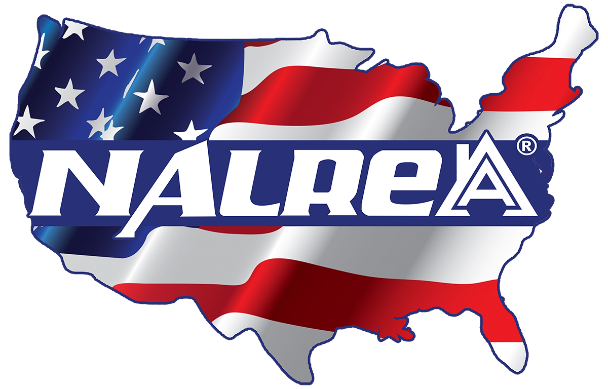


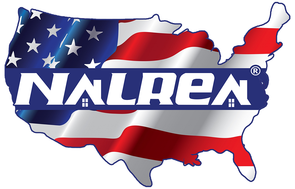
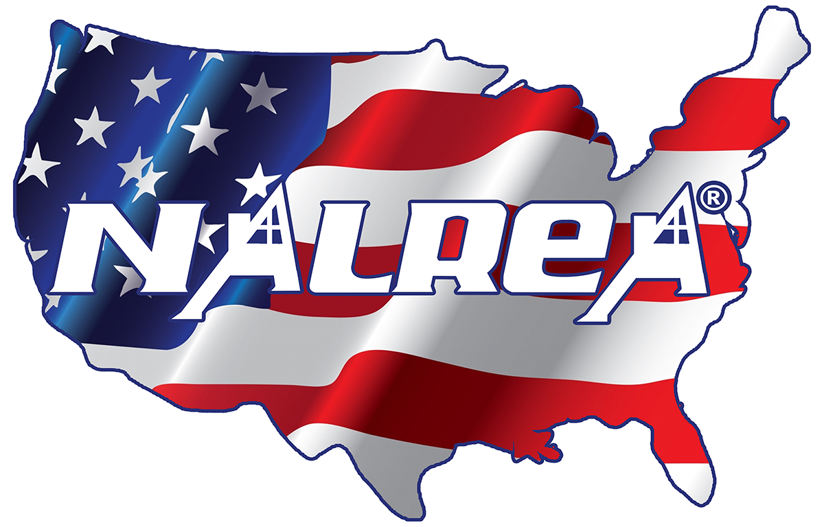
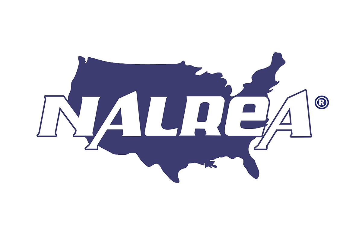
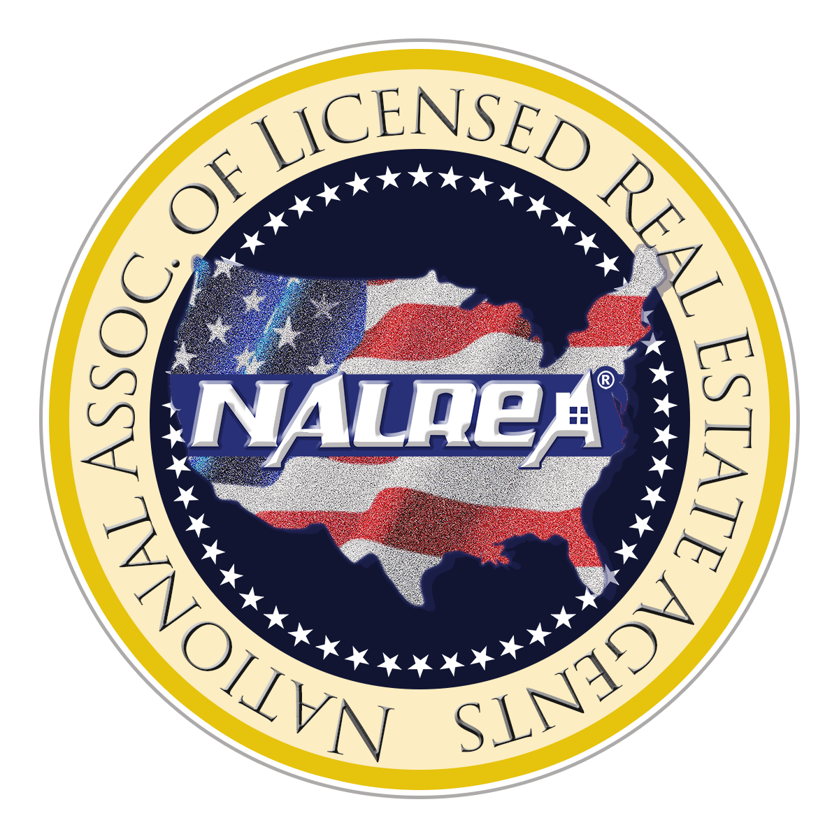
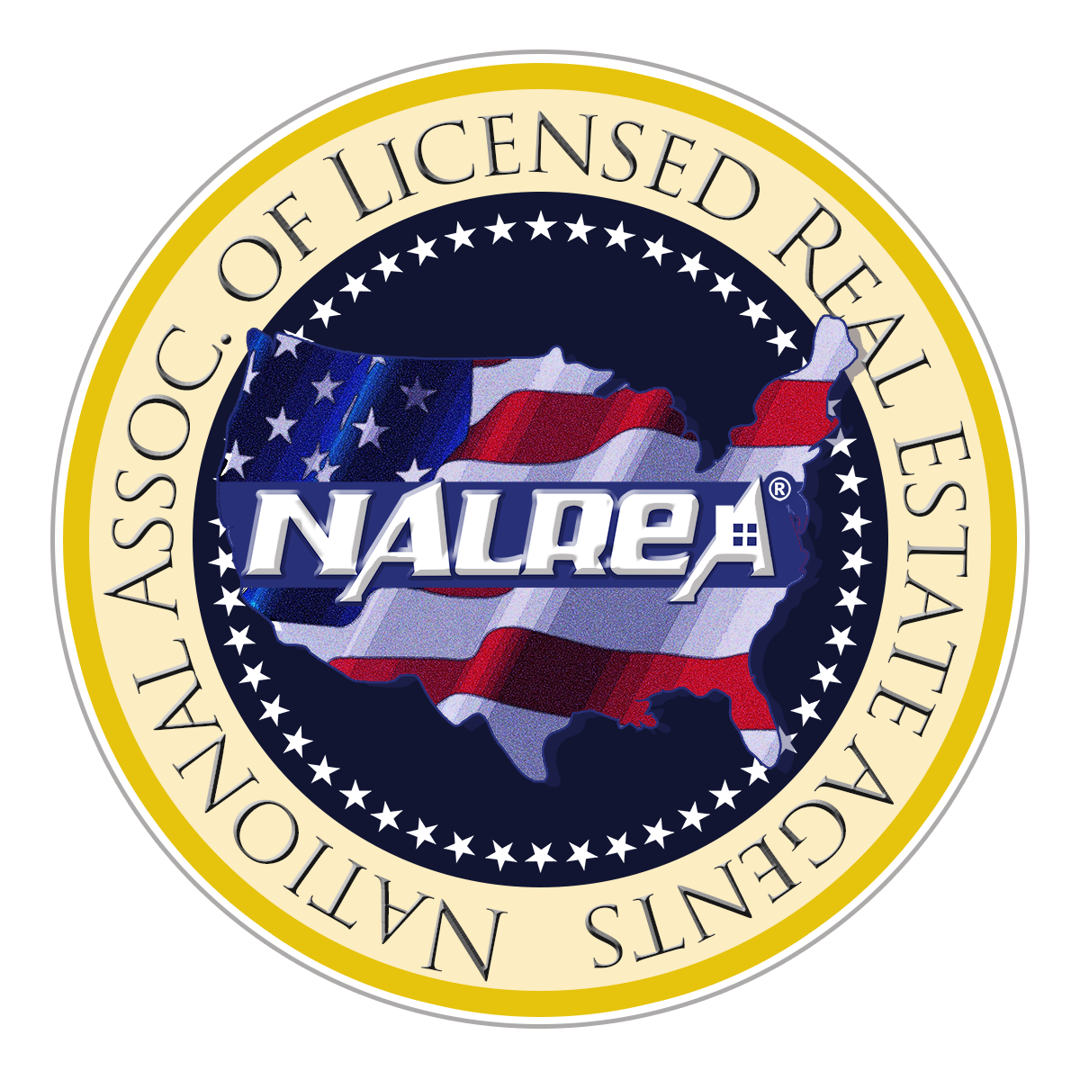
This of course is the treatment he chose, but he wanted some variations on the house graphic and the textures of the flag. These are so insignificant I almost didn’t include these but it might be interesting to see the subtle variations as a logo is developed.
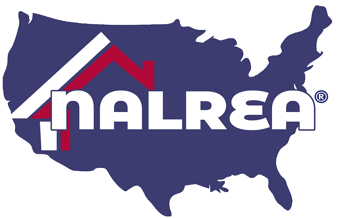
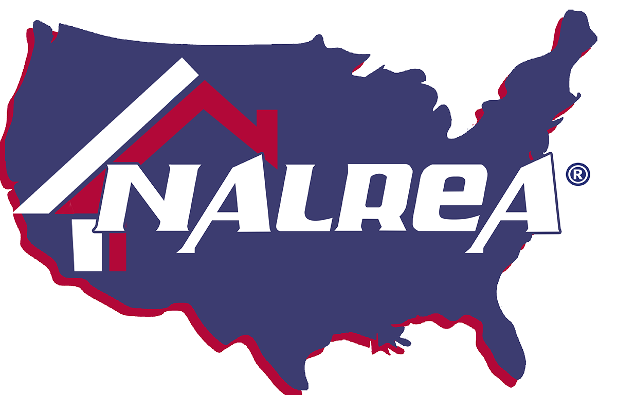
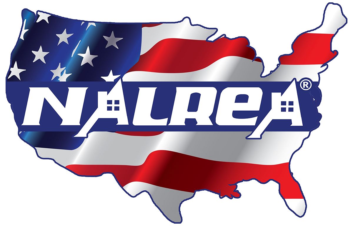
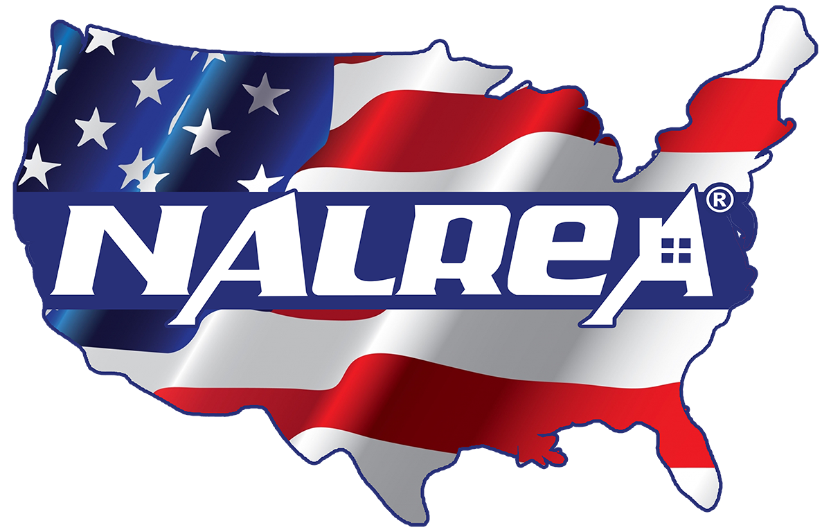
Take 3:

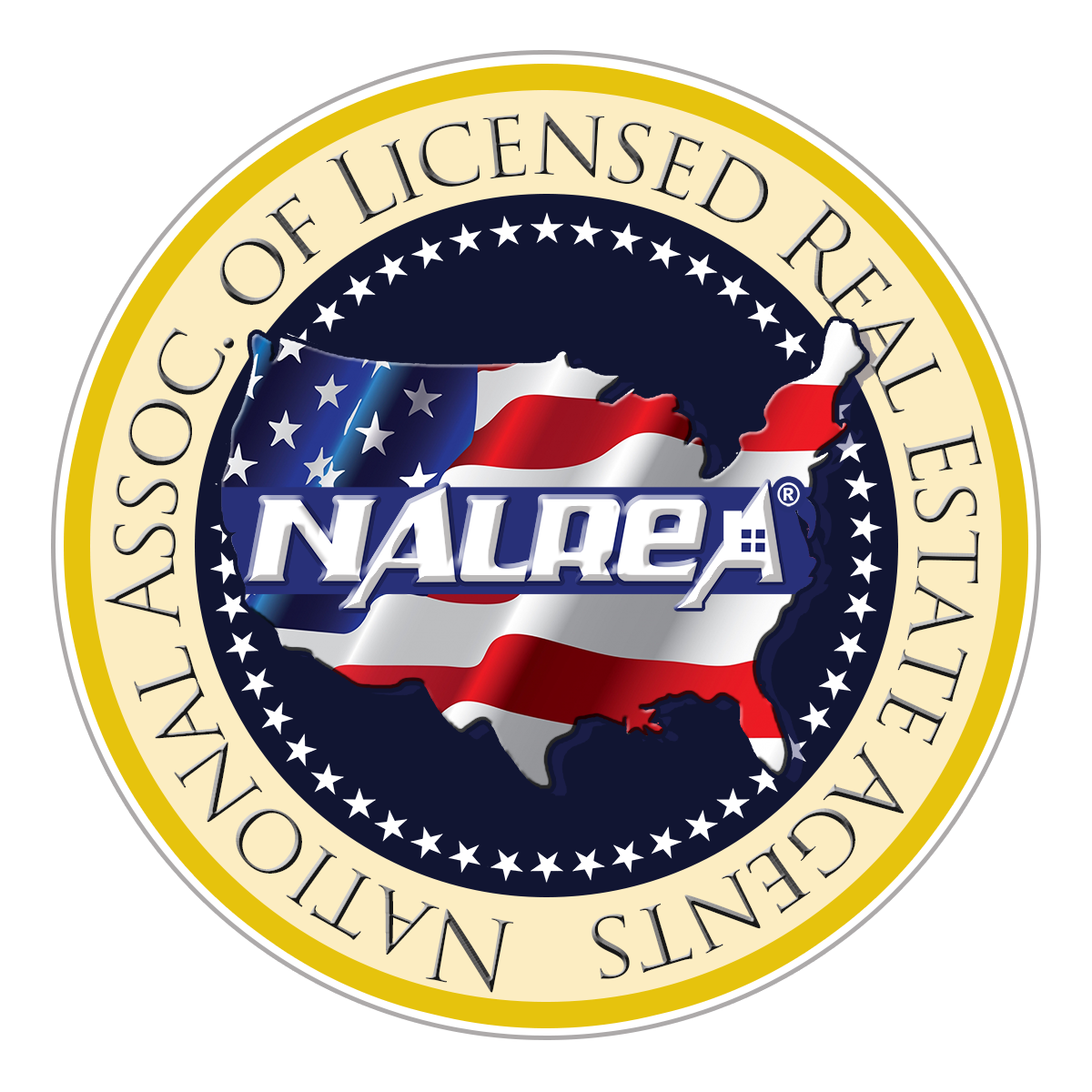
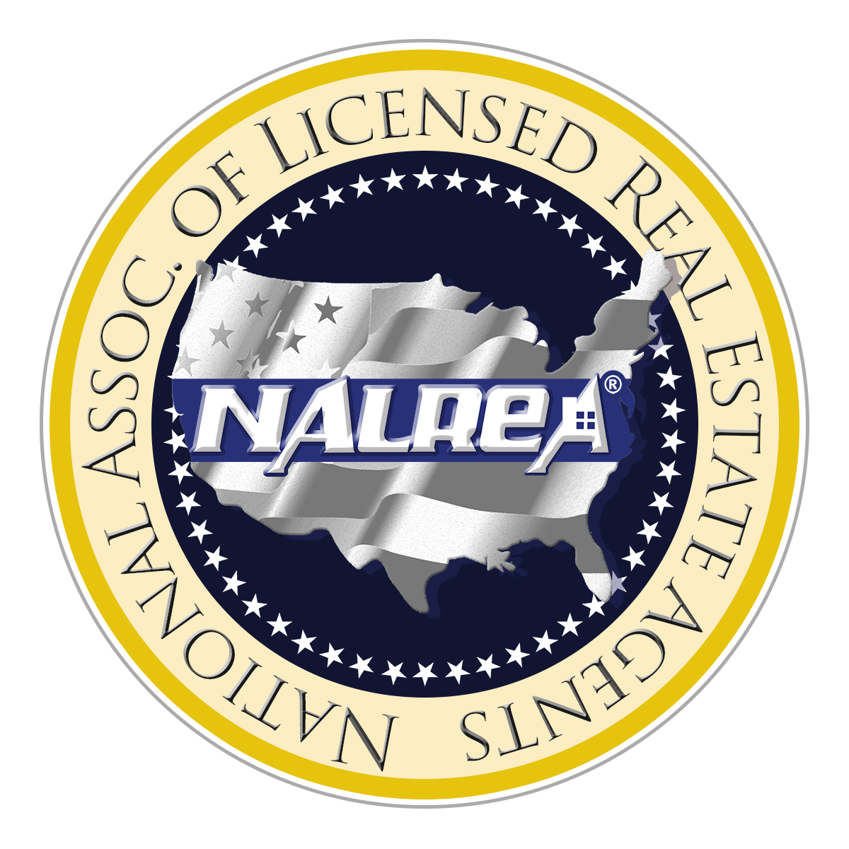
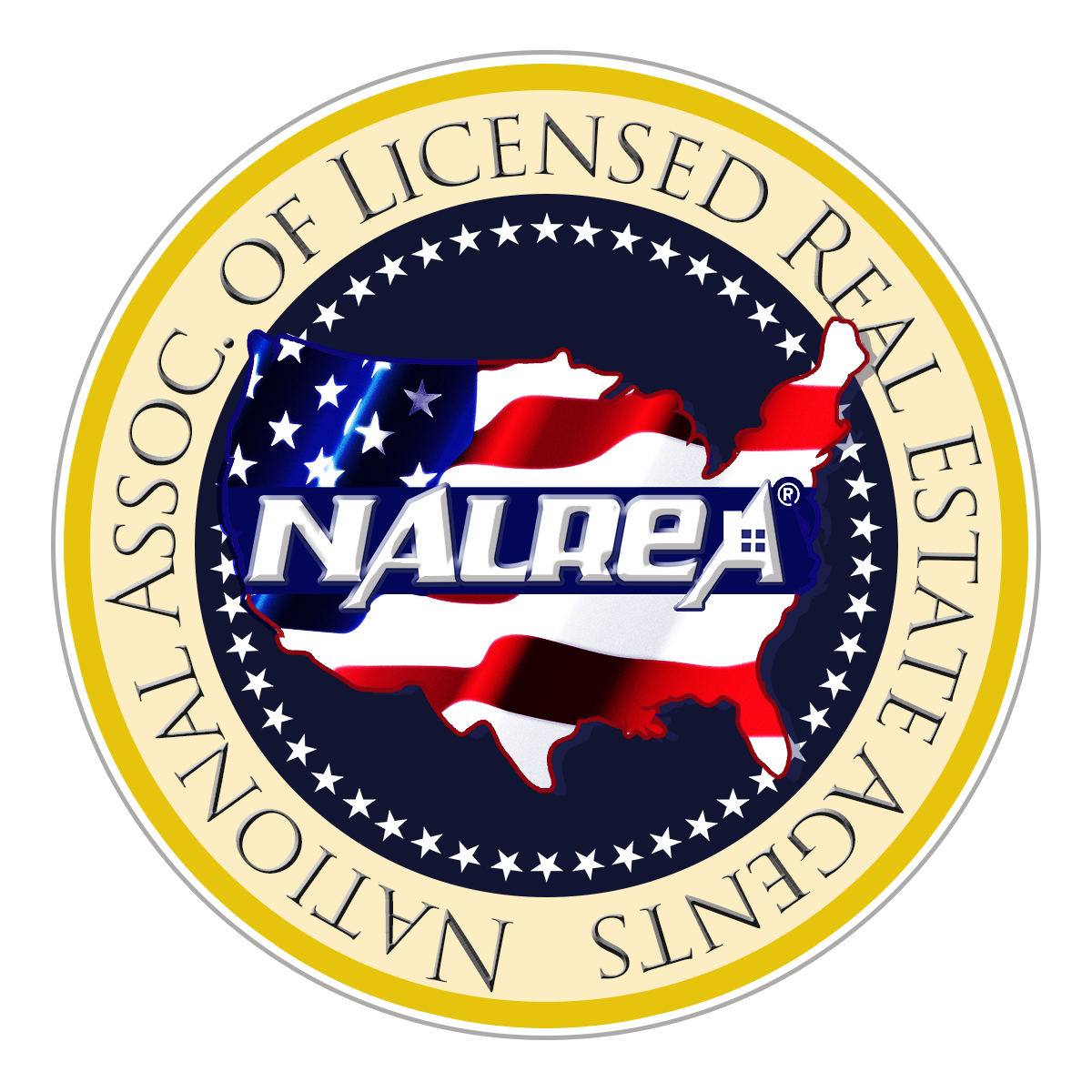
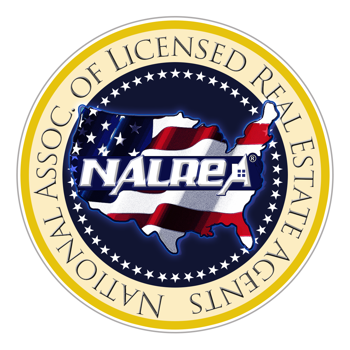


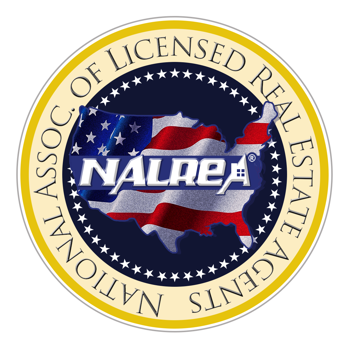
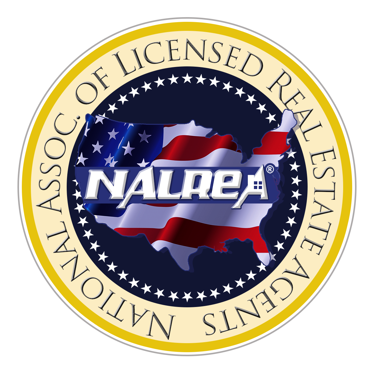
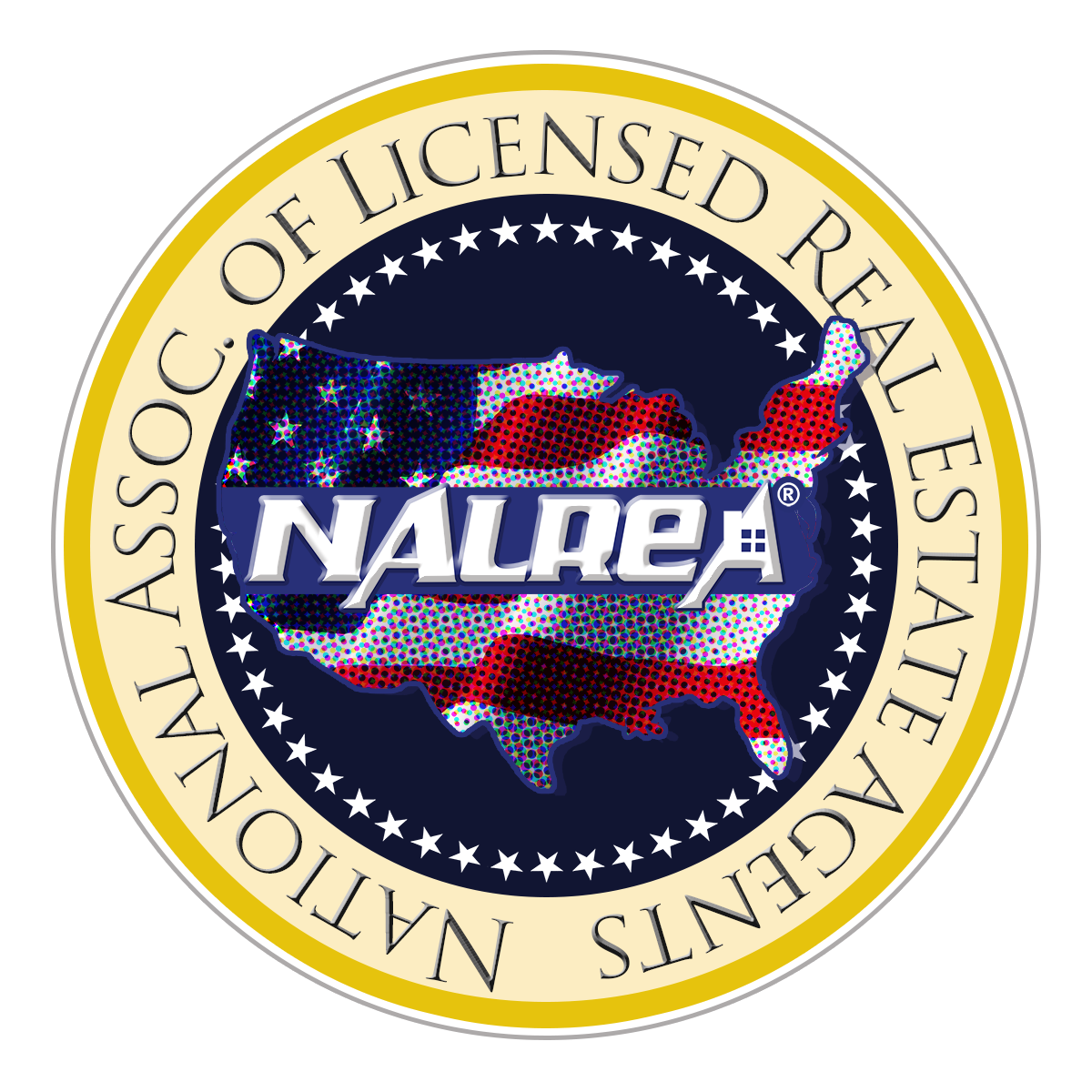
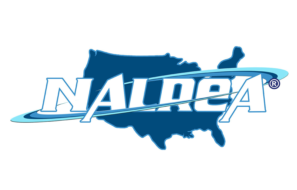
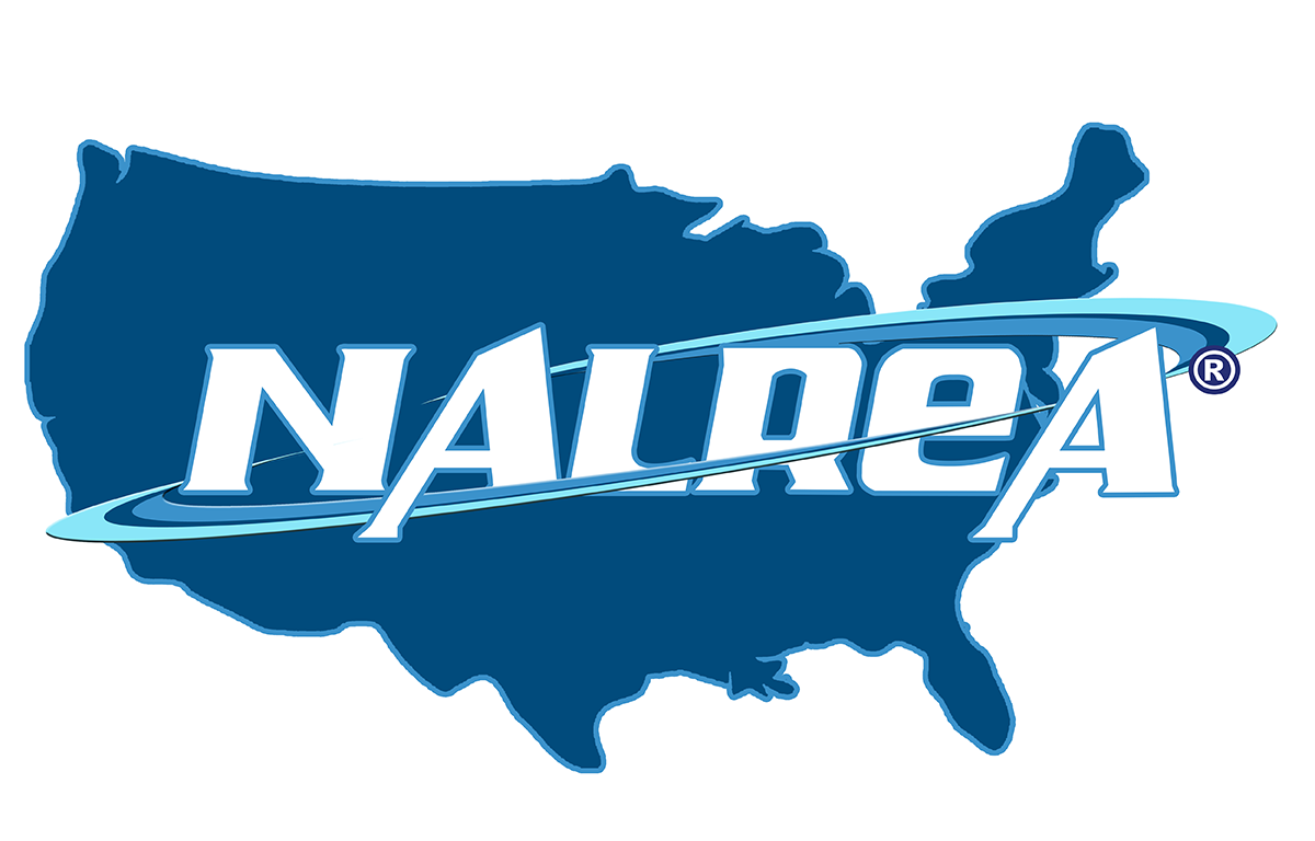
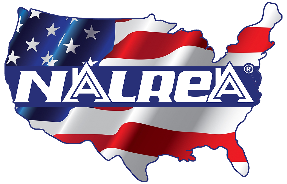
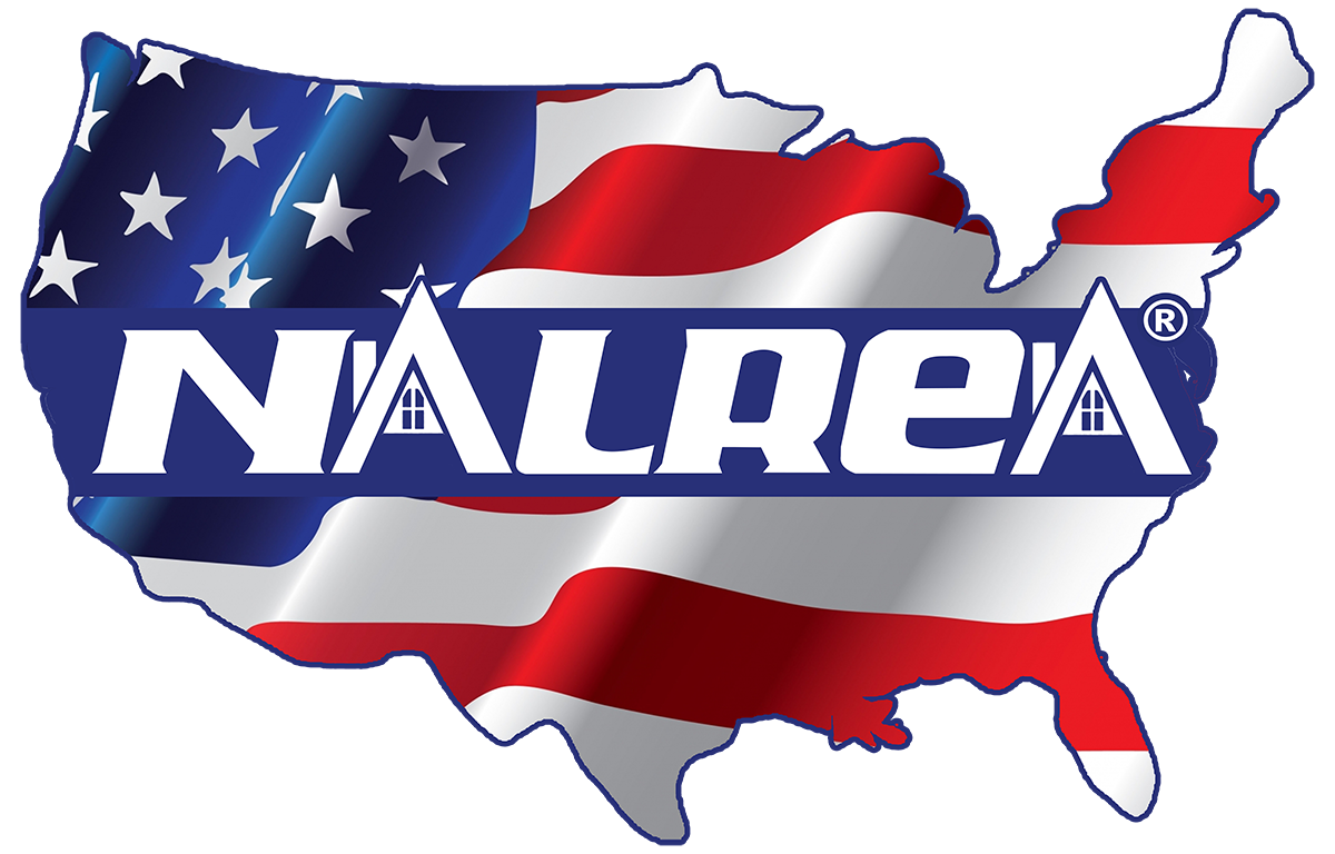
At this point the client decided to go with a design similar to the Paradigm logo or the seal of the POTUS. These, again, are subtle variations of texture and tint and hue. The final is the one at the beginning of this post.