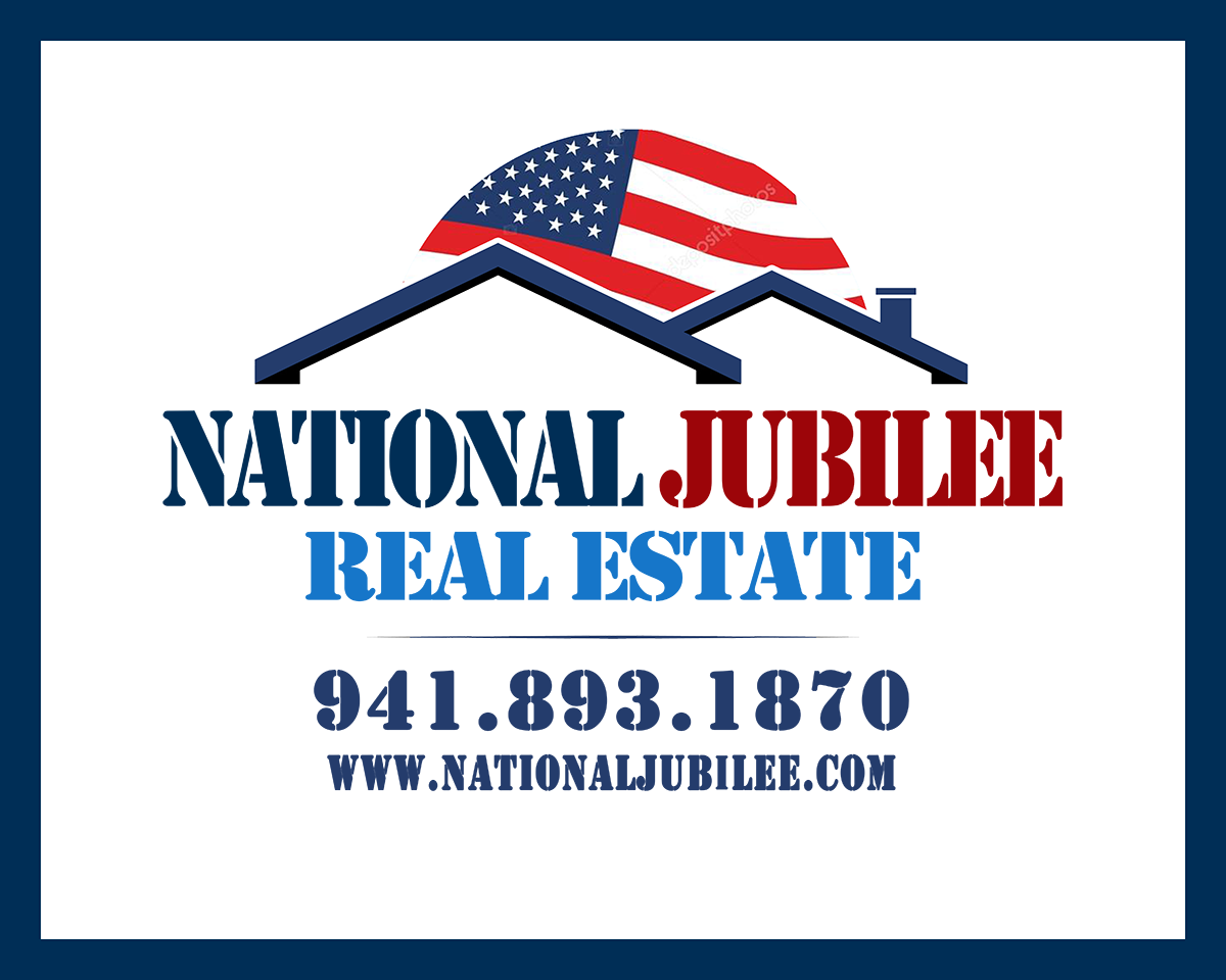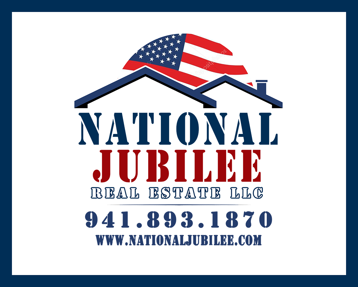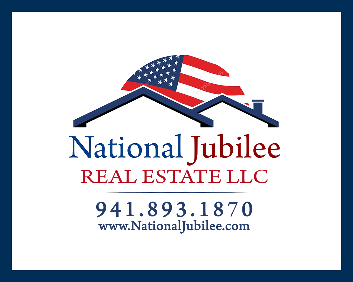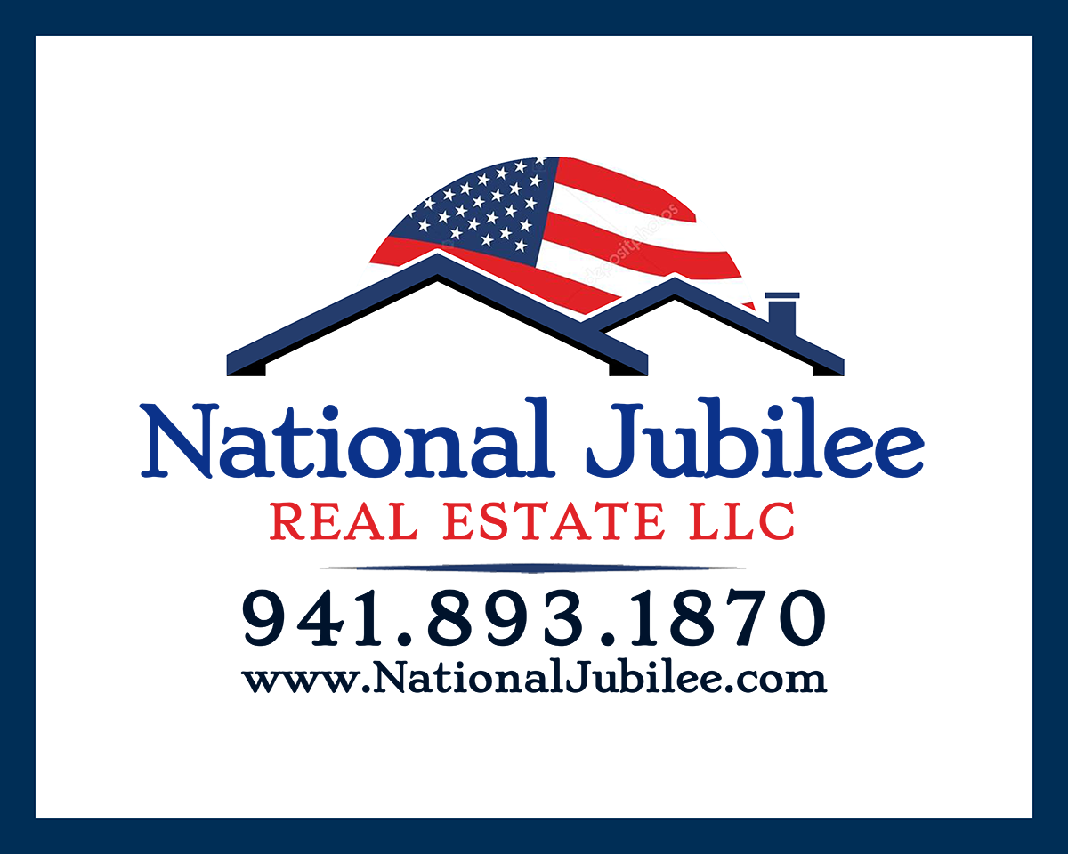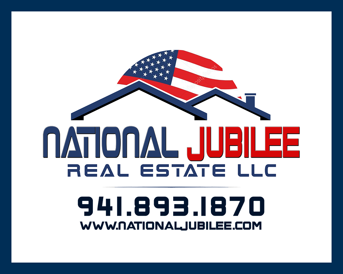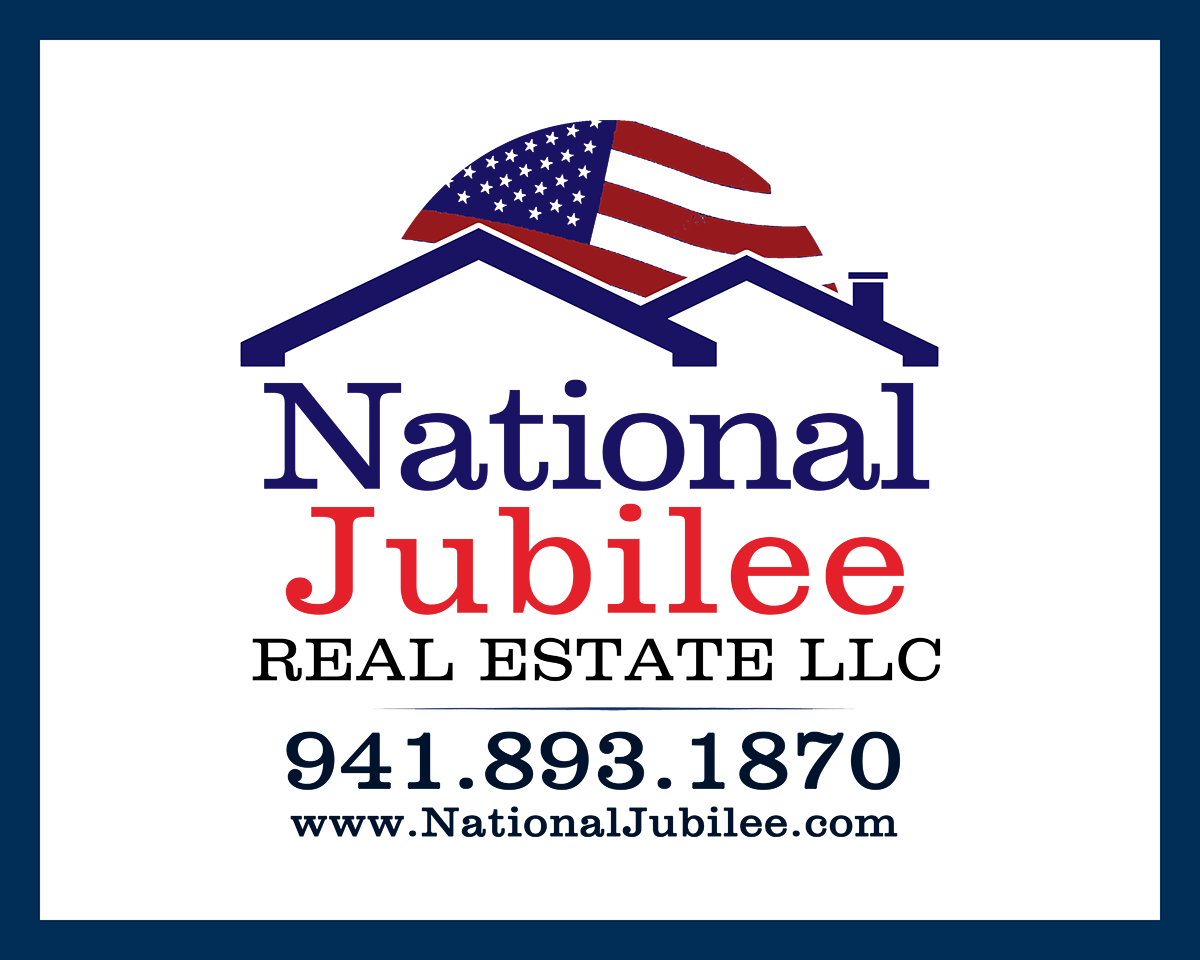

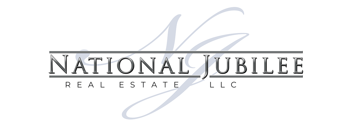
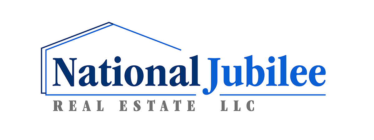
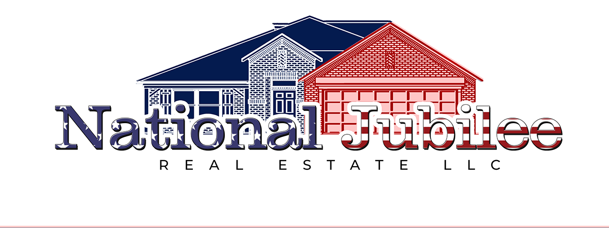
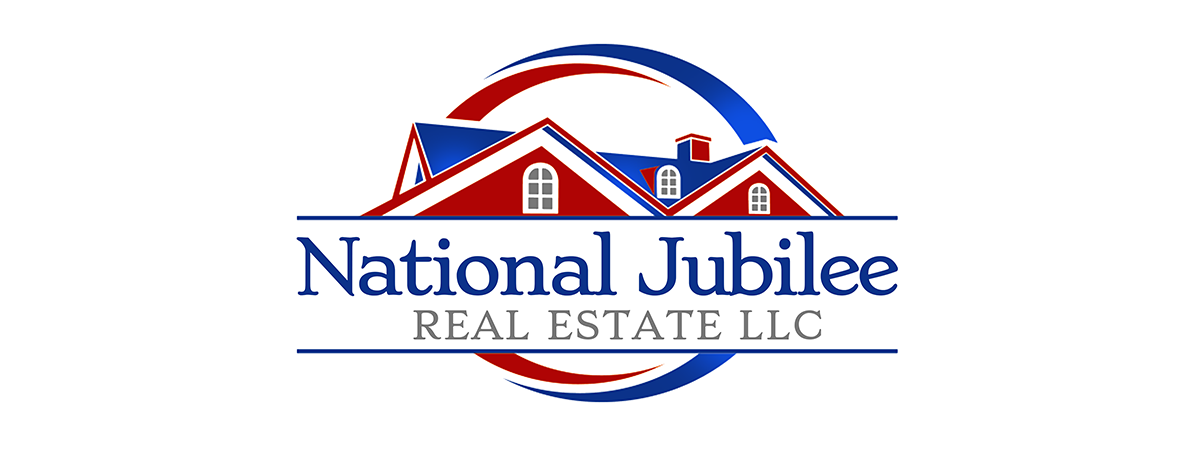
A case of the strongest design fights its way to the top, I think you have to agree this one at the top is the best of the lot by far.
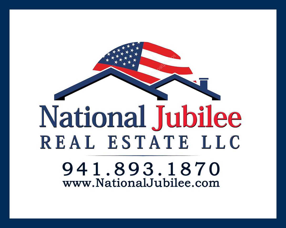
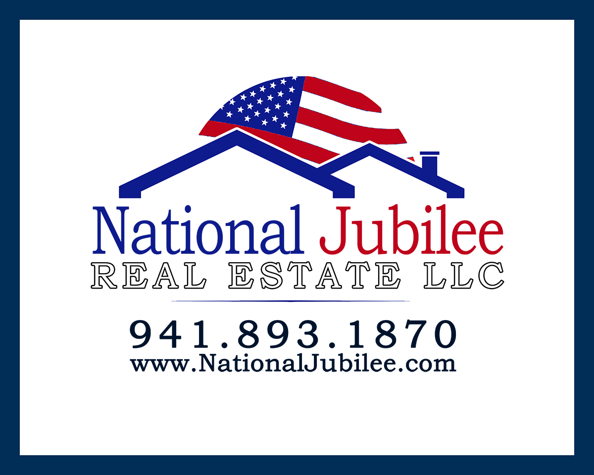
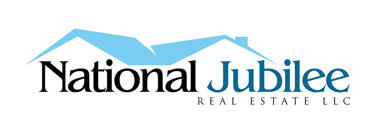
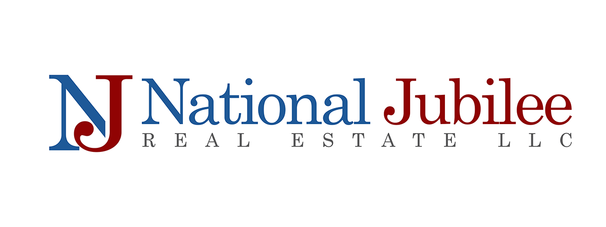
This was for a short selling company so a house or roof was needed, a solid, stable, trustworthy font and the owner is very patriotic and wanted a nationwide color scheme.
He also liked a classic style and strong fonts.
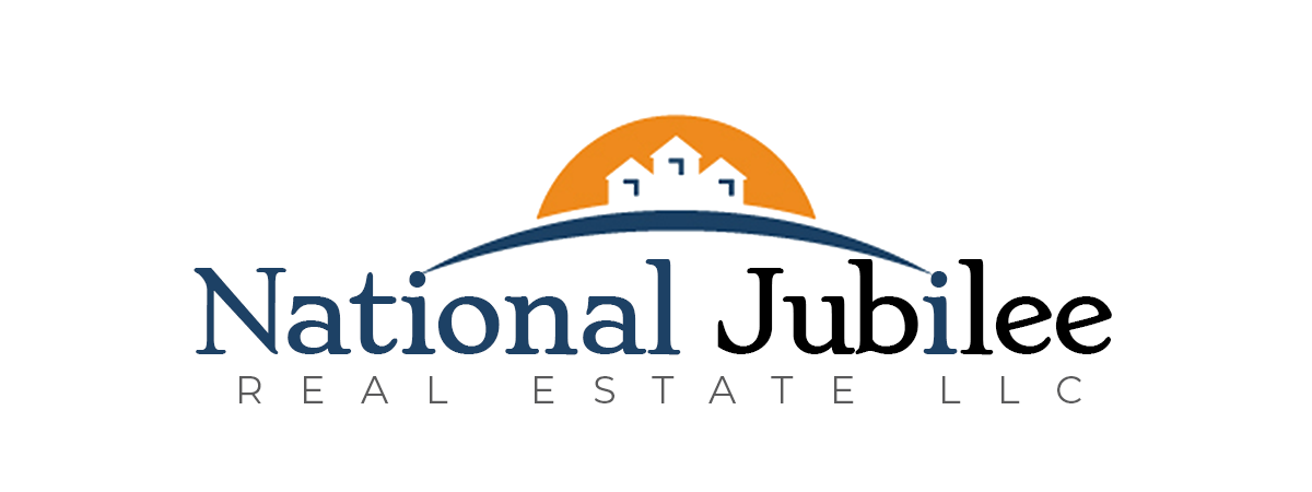


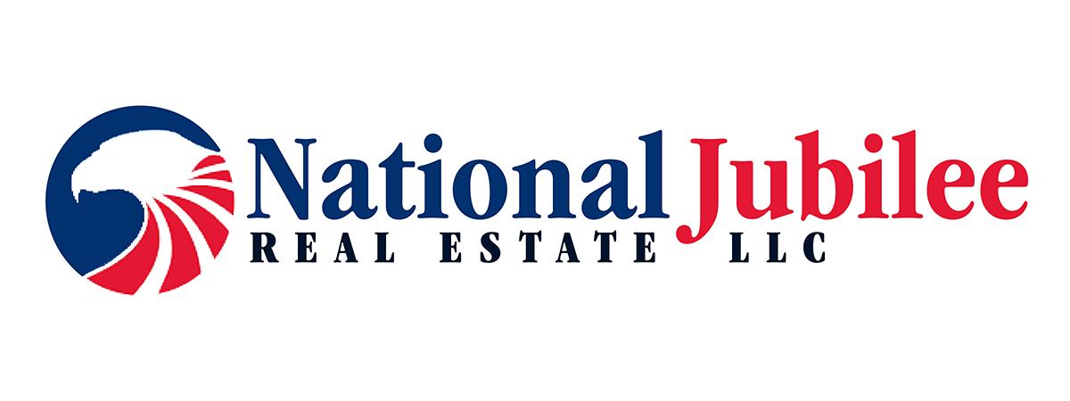
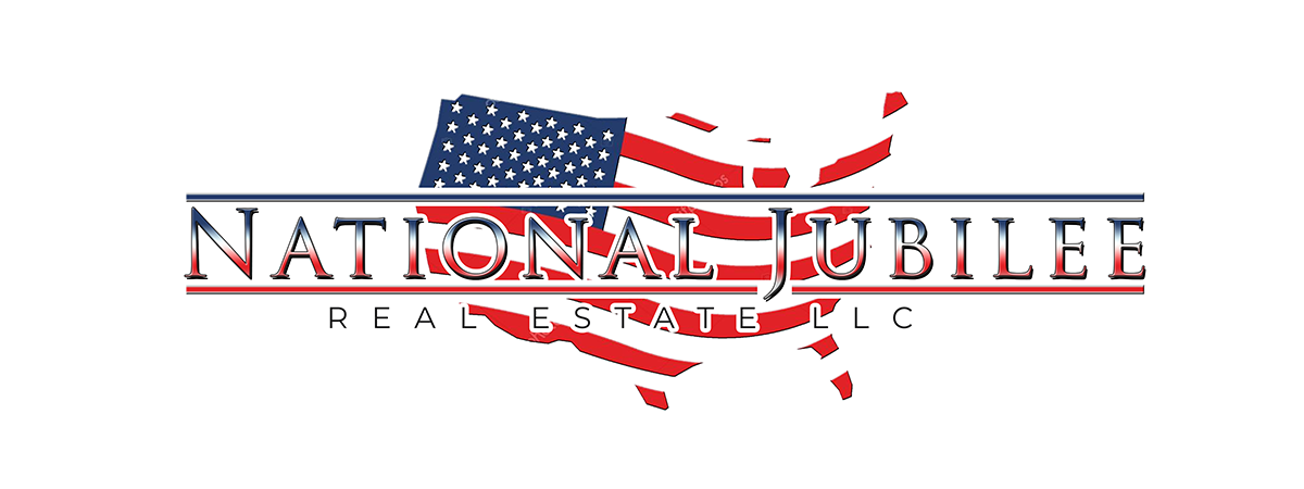
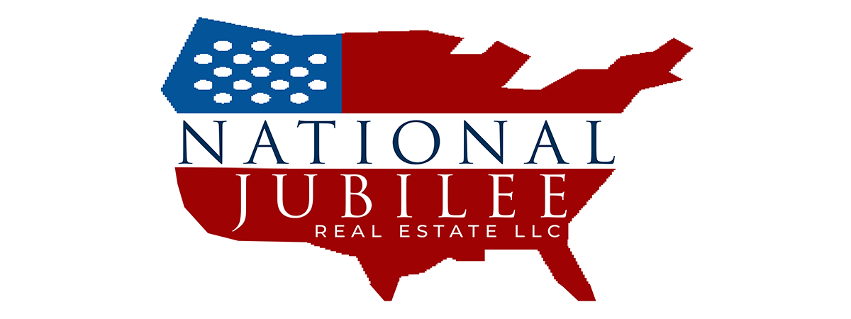
In a rare situation, the client didn’t like even the direction of any of these. I have to admit I don’t love any of them either. Perhaps I was not inspired that session. Back to the drawing board, if the client doesn’t like any of them, that’s on me.

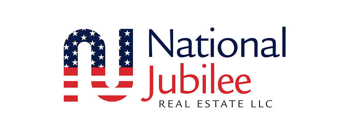

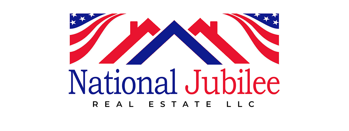


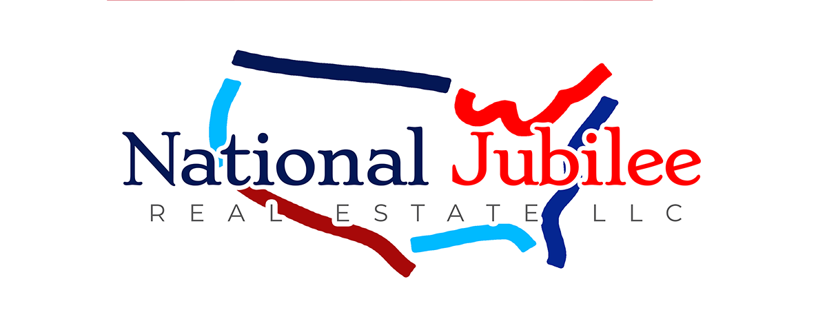
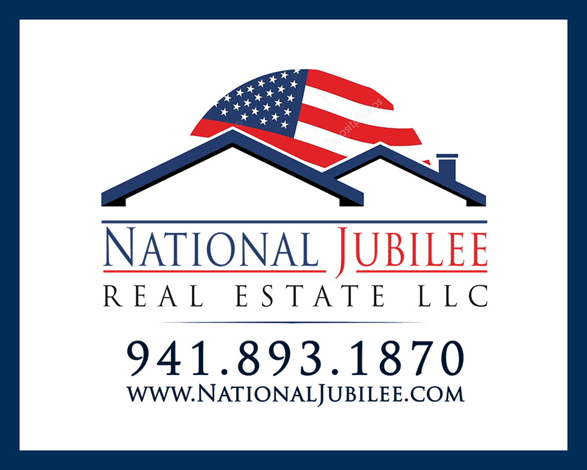
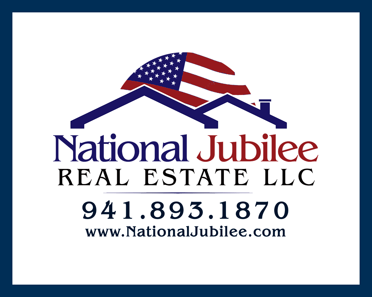
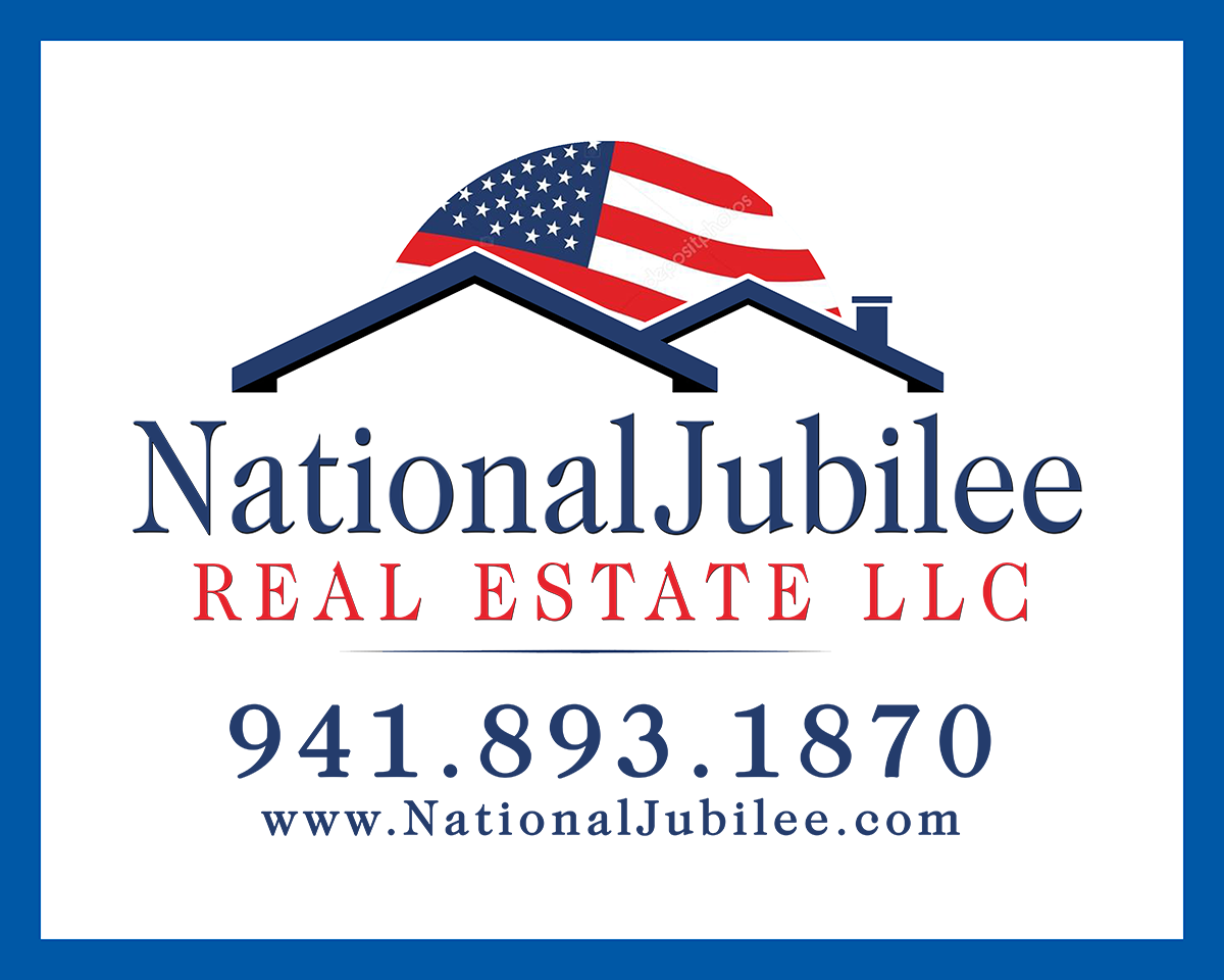
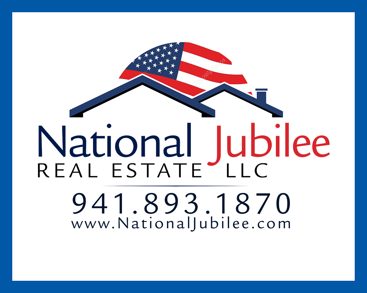
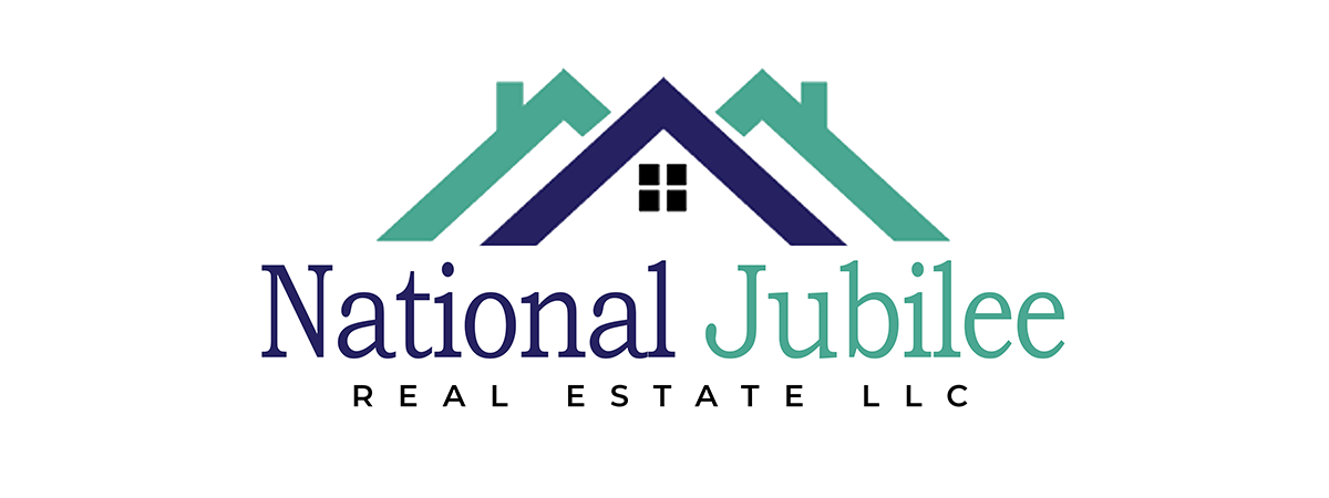
This one he found a strong image which was also my favorite. I did further work on that one, adding
other fonts and arrangements to the same basic elements. He had decided he wanted a flag in there for sure.
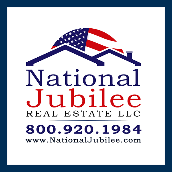
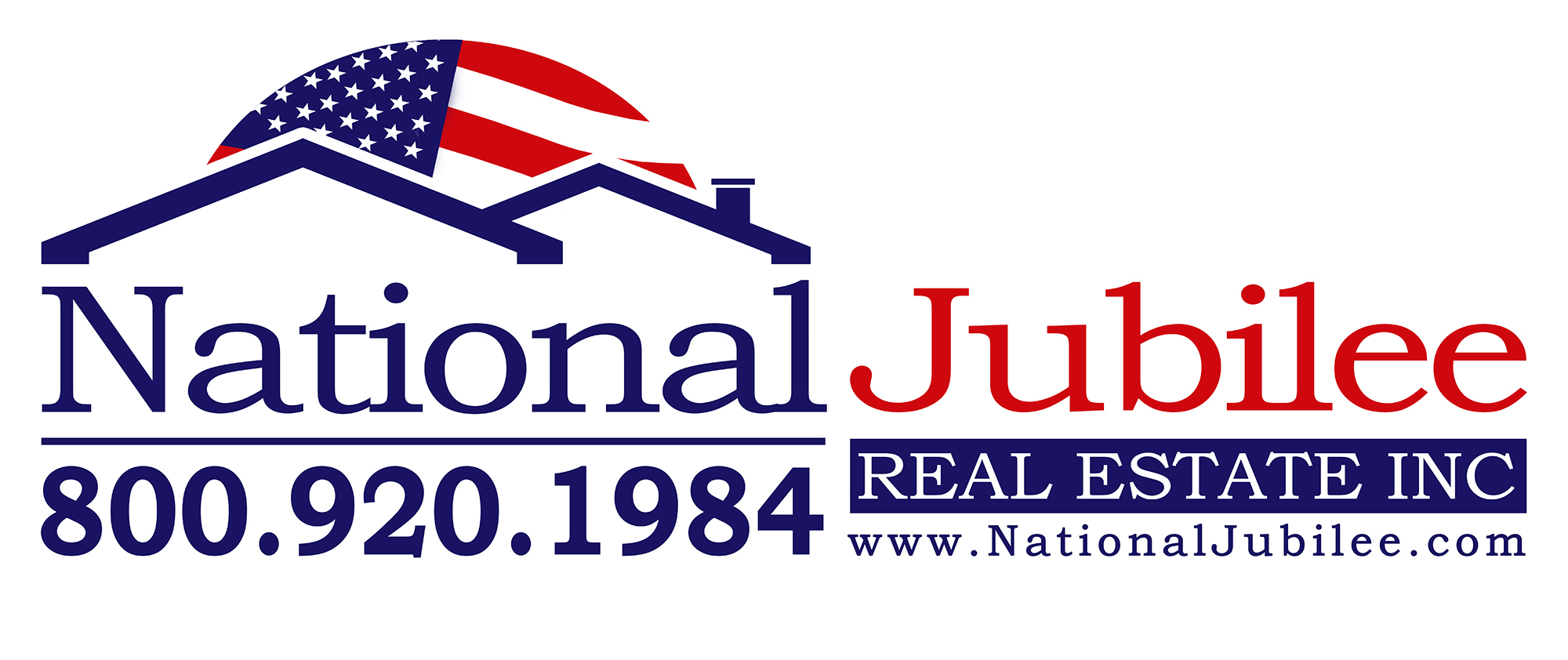

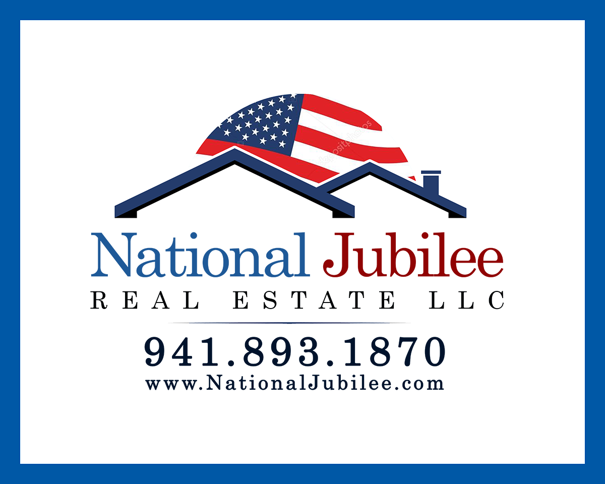
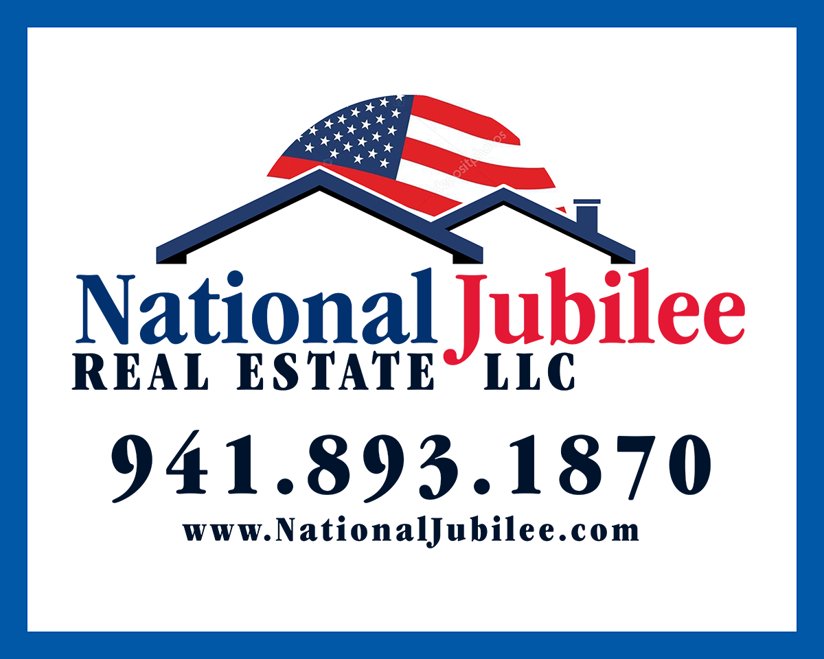
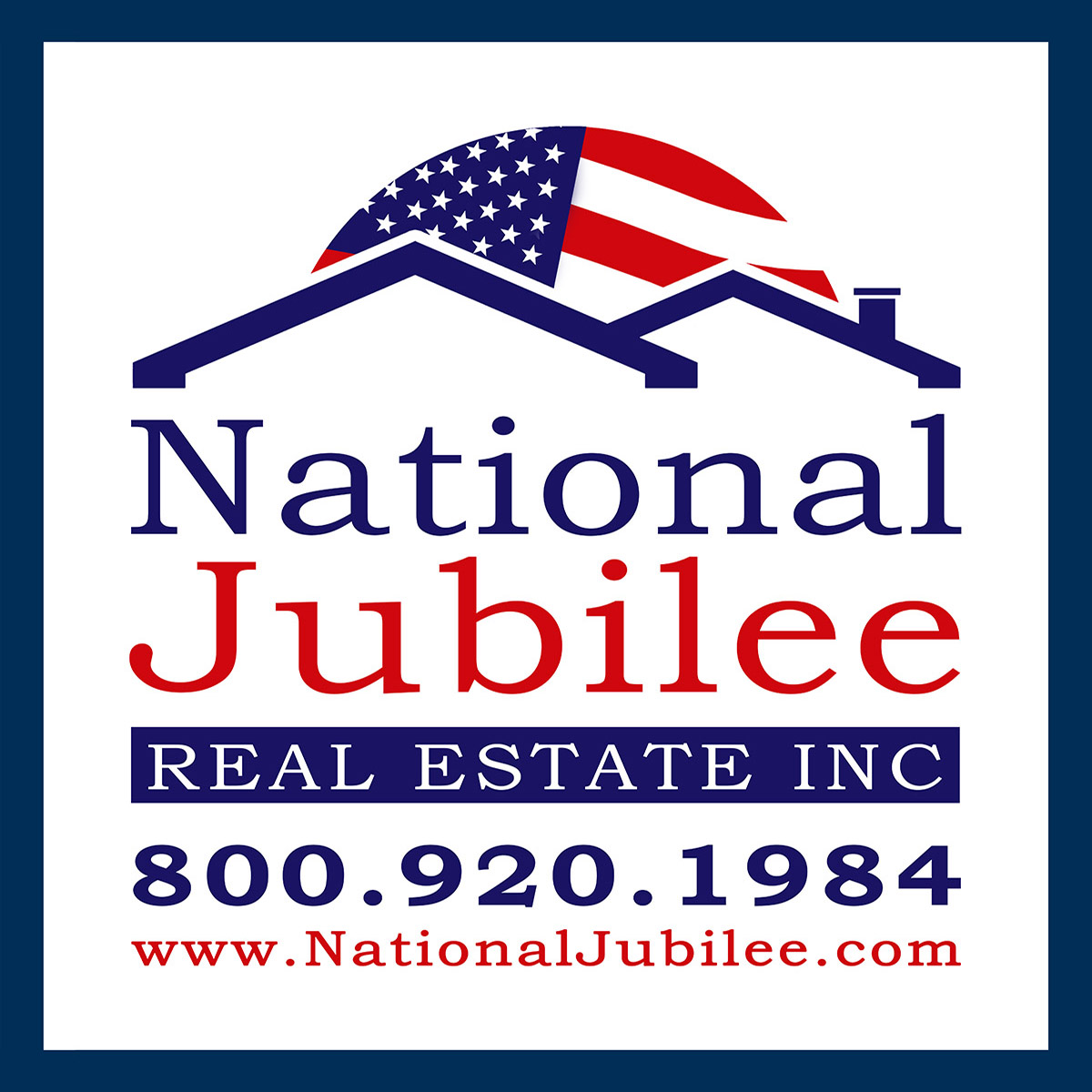
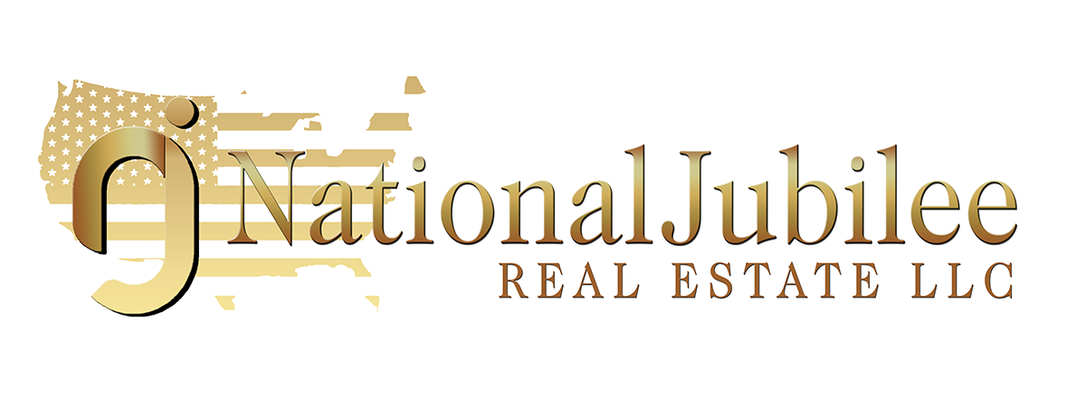
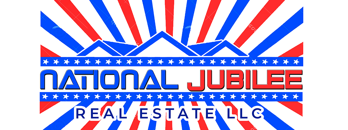
Here are the font variations, along with the 3 final images, which were a refinement of the one he liked. The horizontal version is for the website header, the square one for yard signs, that’s also why it has a border. I think we ended up with a very strong design, clean, memorable, descriptive.