This one was a ball-buster. Normal 3 pass logo development: I throw a lot of ideas, including some basic suggestions from the client (he wanted a globe or globe-like shape) he picks the ones he likes for further development, we do that based on new guidelines, then a final tweak of 2-3 choices with, usually, a clear front-runner. That’s what happened this time, except it went through SIX series of changes (some contradictory) until the final choice. Then client threw out everything we’d done for a new idea he’d just thought up (or actually seen used by a competitor) that was the antithesis of a modern, clean, elegant logo for a backwards, literally 19th century look that wouldn’t work for letterheads, business cards or anywhere else, didn’t have the name or anything to do with the firm.
I completed what he wanted, but left to myself I would have suggested this client might be better served elsewhere and written off the previous work as just too frustrating and thankless a task, but I was convinced to persevere. Maybe I’ll post the abomination he came up with in future. The reason for all these permutations is he asked for as many color and font combinations as possible. Some of these are not great but he wanted a lot of choice and my invention was running dry.
1st Pass
I took his suggestions and threw a bunch of disparate stuff out there to see what might stick. I always throw in a few off-the-wall choices because you never know.
2nd pass
Development of client’s first choices from the first batch (and he wanted some new choices as well:
3rd pass
Development of choices from 2nd pass with client’s notes (by now I’d done more exemplars than I ever had for any logo development). His notes mainly consisted of “more examples of this type”
4th pass
I felt we were going a bit off the rails here and the client was asking for stuff he never planned on using, acting like pumping these out was like turning the crank on a barrel-organ when some individual logos too over an hour to render and I was doing dozens per pass. He not only chose some basic designs for further refinement and detail, but also asked for new refinements of his own.
5th pass
Still didn’t feel we were narrowing it down much at this point and I knew it would take one more pass, which is a frustrating. He told me to give him examples of these 4 basic designs without much direction, and I adapted colors and outlines and outer and inner glows and color filters etc.
6th pass
Development of (what I thought would be) the final version, as he had settled on this basic design but wasn’t quite happy with the details, so I attempted to extrapolate, again with color, outlines, glows, filters.
It was after this he threw out everything we’d done and started over. While I don’t let personal pique or ‘artistic temperament” get in the way of satisfying the customer and getting paid, I felt this guy was being manipulative and taking advantage, but I agreed to continue to work because my employer was in a hard place. I wouldn’t do it again, however. This was a nightmare client. Sorry to include this in a portfolio but this illustrates my ability to put up with a great deal of crap, maybe too much. My middleman failed to lay down solid groundrules before we began, and that hindered the process and made it much longer and much more work for me. My standard deal is:
1. I produce a couple different, disparate designs based on general guidelines, colors or design elements the client would like to see incorporated in the logo.
2. The client picks one or more that seem close enough to concept and develop them further, based on his direction.
3. He chooses one from that distilisation and maybe makes a few tweaks, but by now we usually have something very close. If they are still dissatified, they have given me poor instrutions or changed their mind on something, and each successive pass will cost them 1/4 of the total fee for the logo.

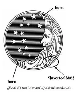
In this case, after 6 passes, none of these were ever used. At this point he said he never really liked any of them and wanted to start over with a design based on something he sketched, like an old retro engraved logo like Proctor & Gamble (which was btw a Satanic symbol, which explains a lot!_


