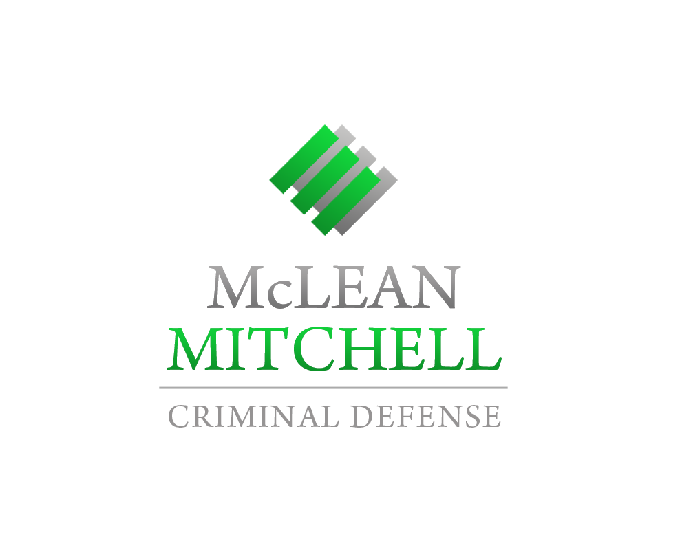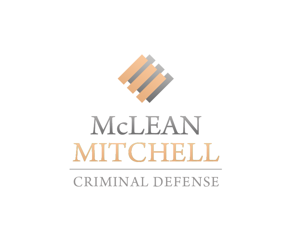

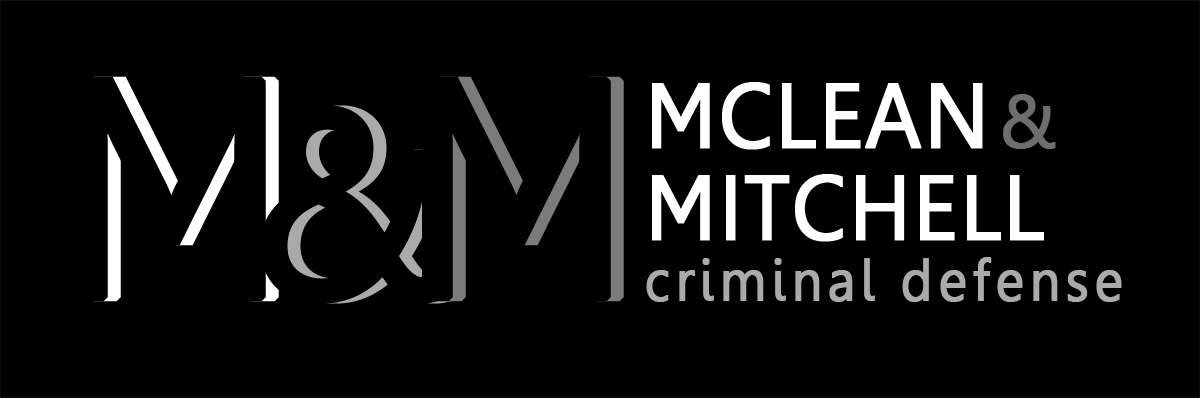
2 stages of development: I first presented this gallery. They liked the one with the bars so I worked on further developing that one with colors and fonts.
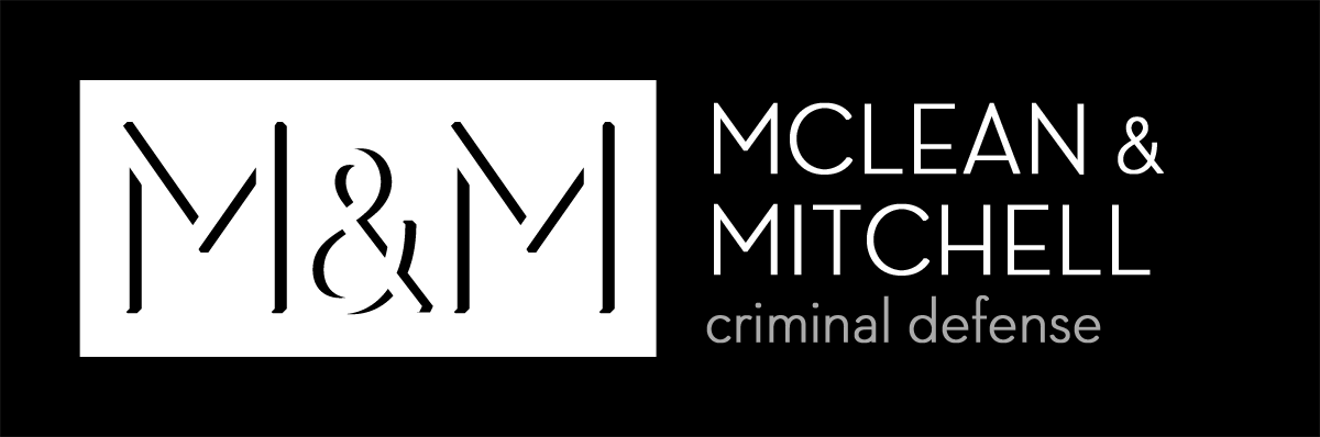
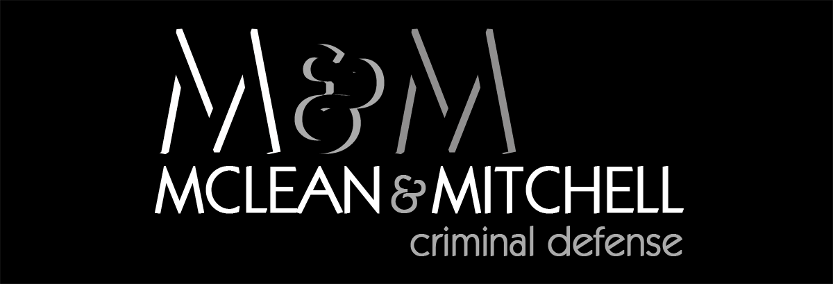
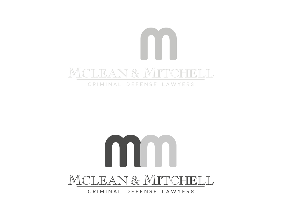
1st pass M&M logo.

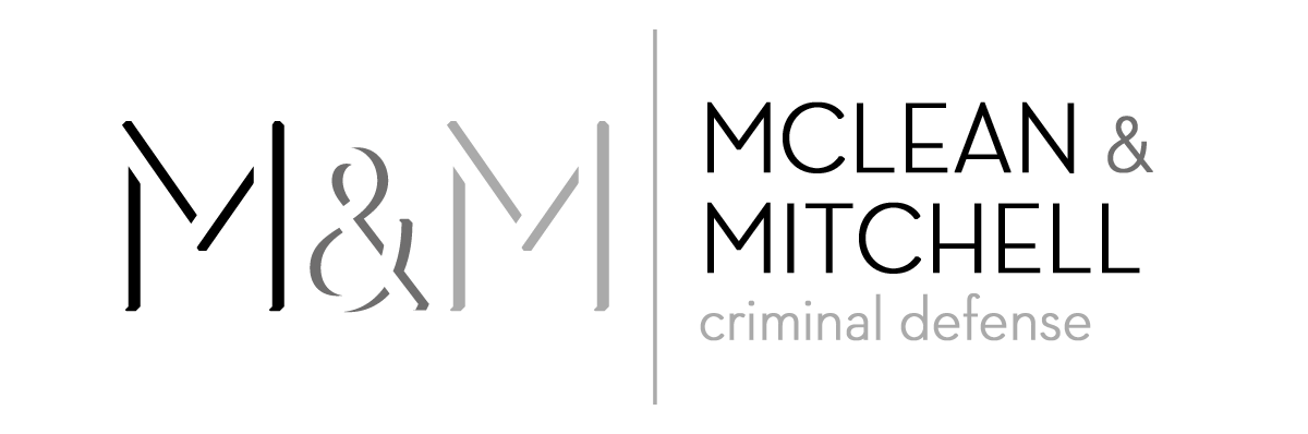

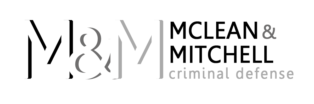


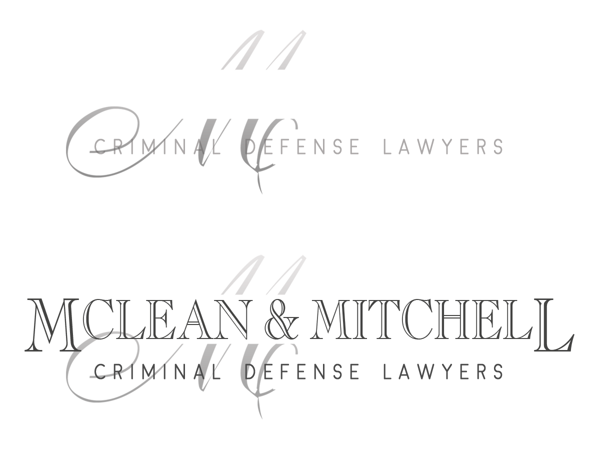

2nd pass
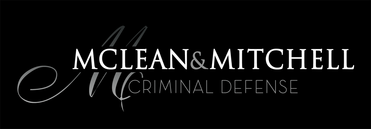
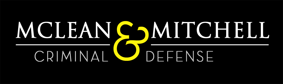
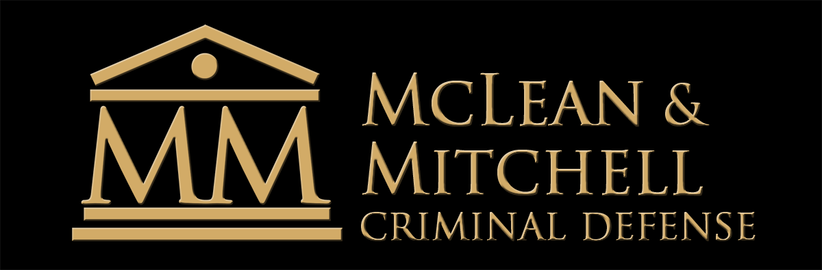
2nd pass at creating a logo for a new law firm. When I do the first versions I try to make them as varied and different as possible: at this sage there is no sense doing different colors or fonts for essentially the same design. For the first pass I present a wide range, they can then choose which one is in the right direction, then we can experiment with colors and fonts on that one. This saves a lot of time and doesn’t confuse the client with too many choices. Anyway, they liked this basic design so I made some color variations.