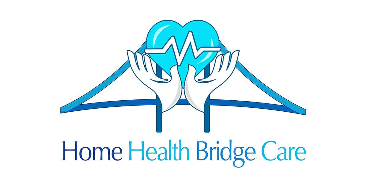
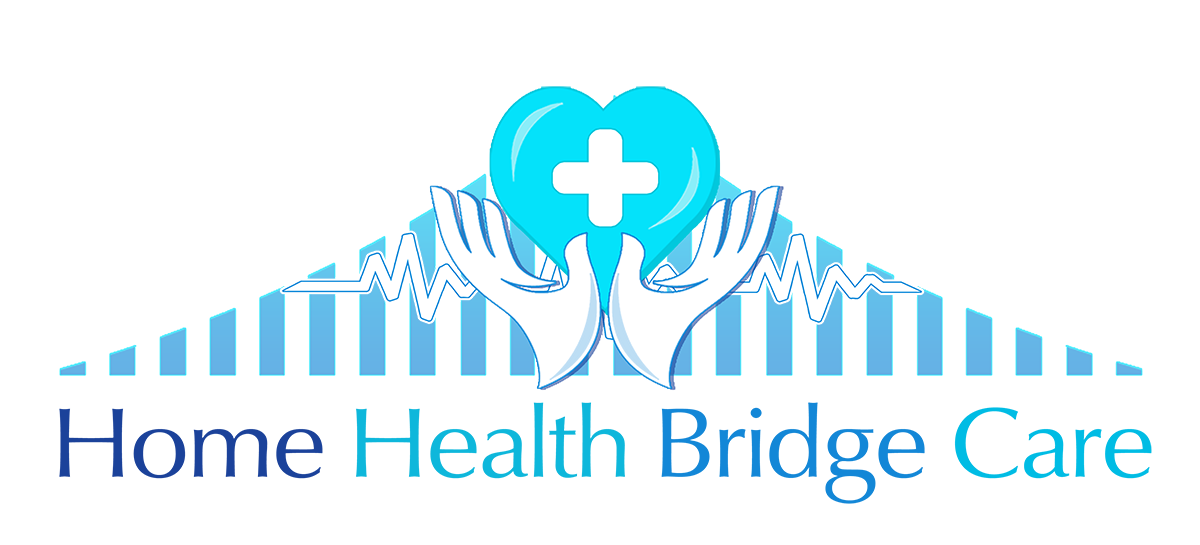
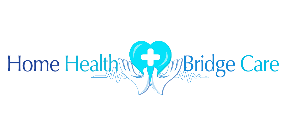
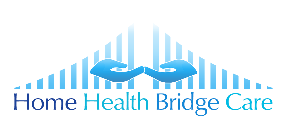
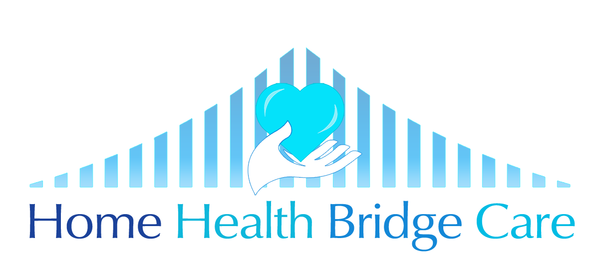
This logo was for a website, t-shirts, uniforms, letterhead and other uses for a home health service. She wanted something in bright colors that was upbeat, fun and radiated ‘happiness’ and incorporated a bridge, hands and a heart. The 2 at the top here are my preference on the left and the one the client picked on the right, which is pretty good too I guess. I include these evolutions because it might be interesting to see what I come up with off the top of my head, then how the client refines her choices to the final version.
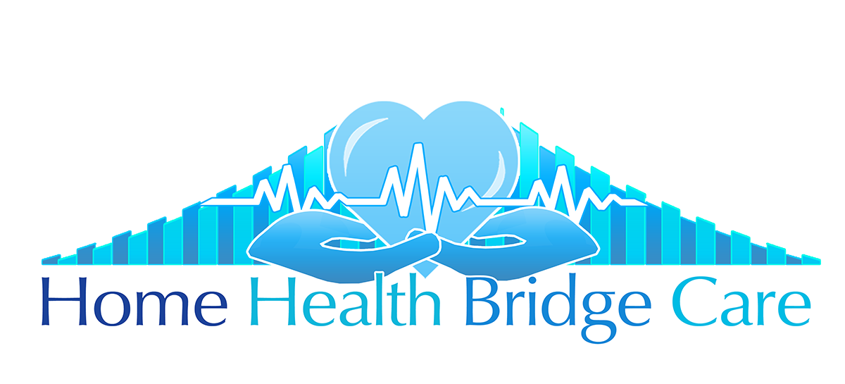
Take one:

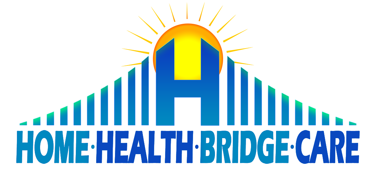
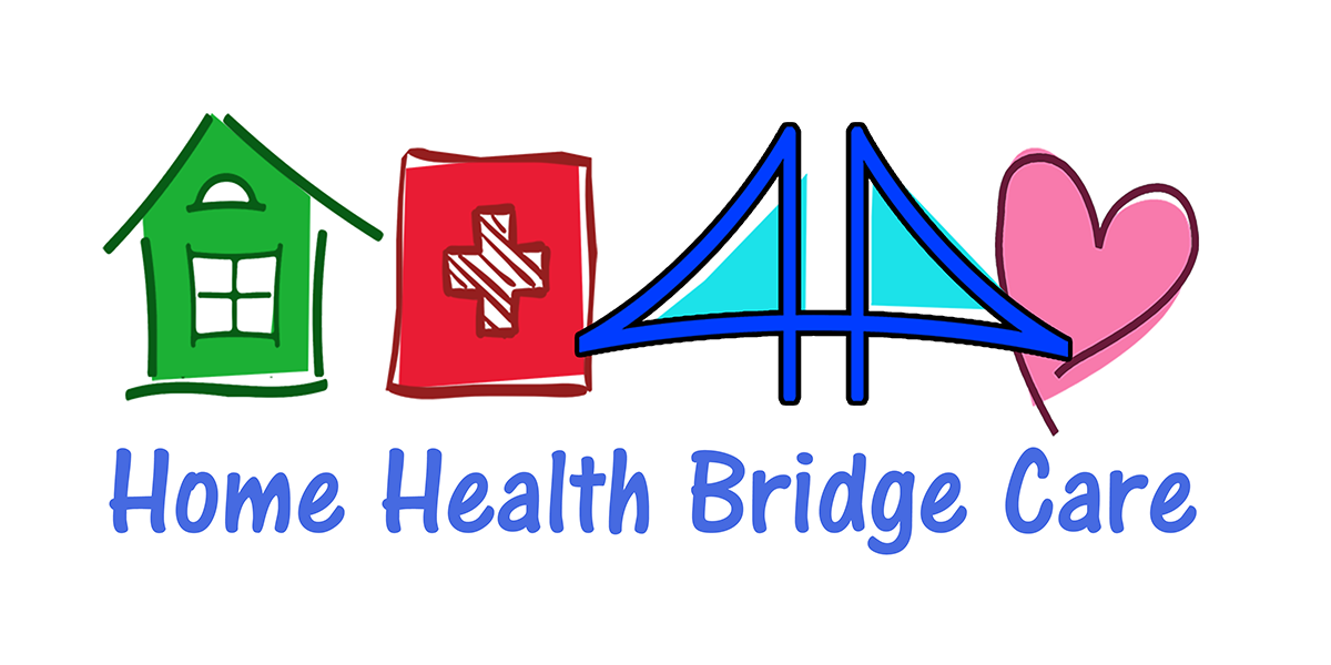
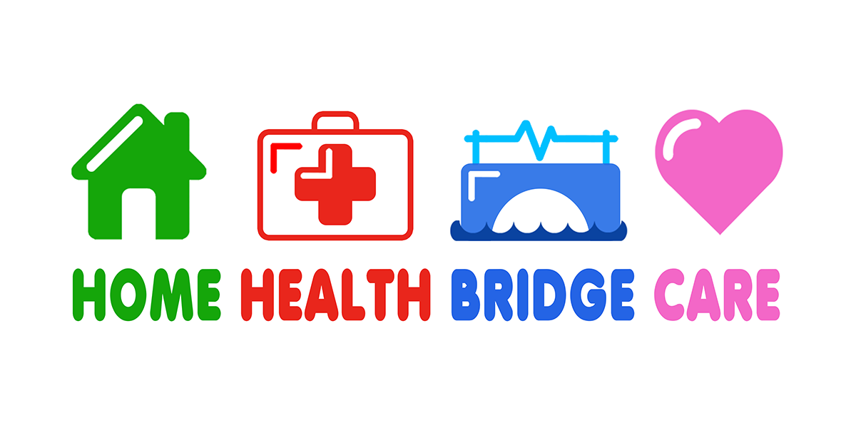


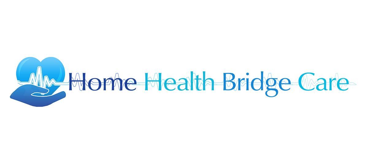
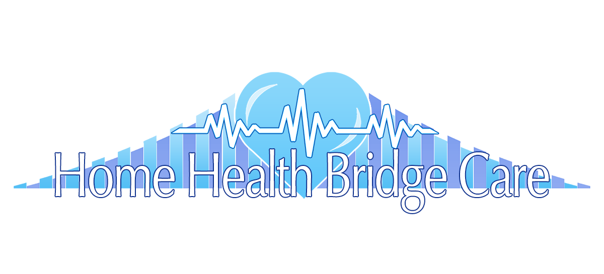
Some of these I think I took the concept of primary colors and ‘fun’ too far to the point it looks like a logo for a daycare center. However, there is some workable stuff here. I also toyed with some ‘inline’ images instead of the bridge over troubled text.
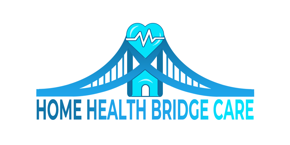
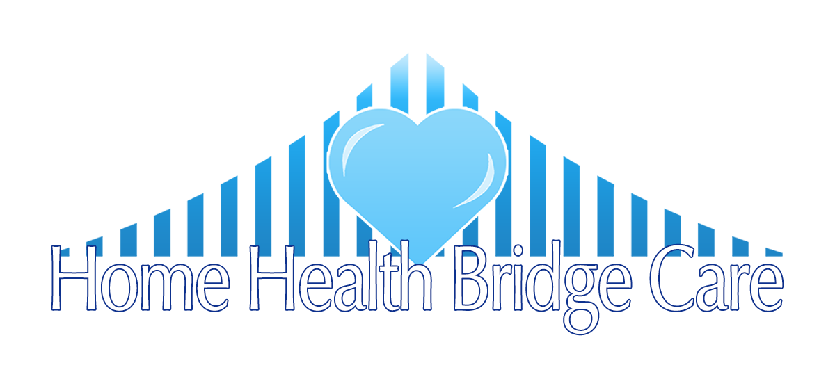
Take two:
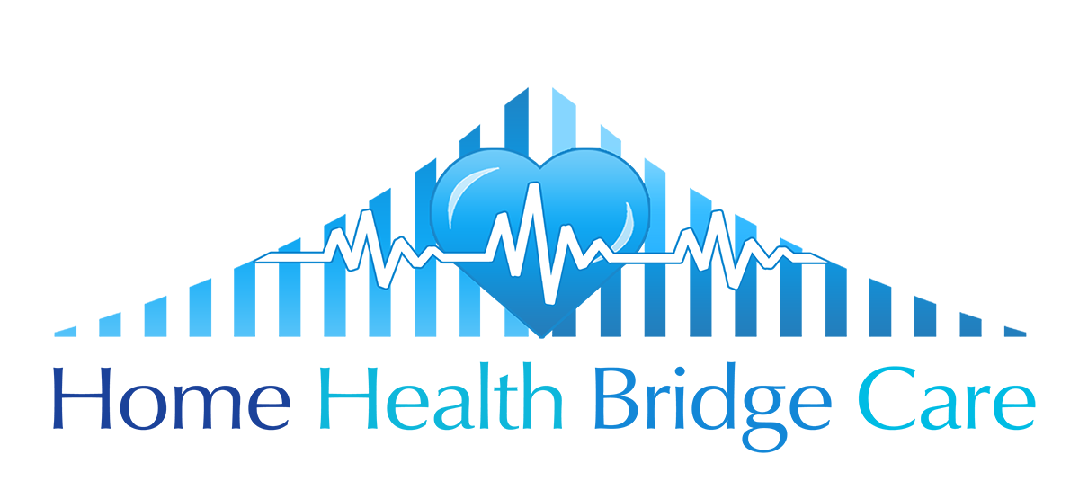
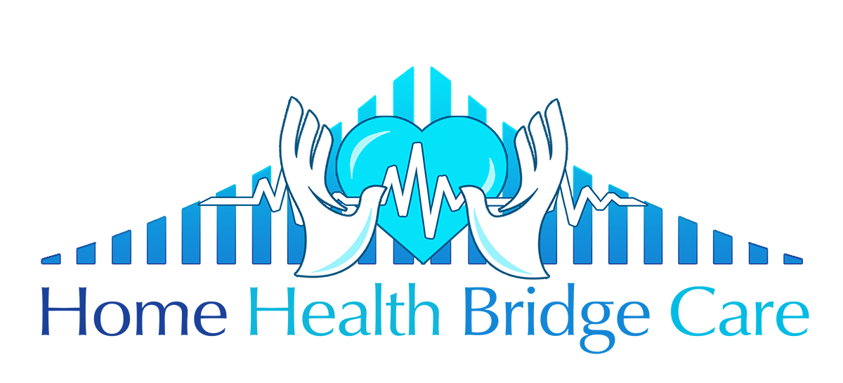

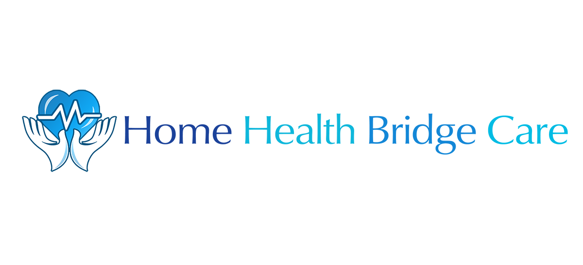

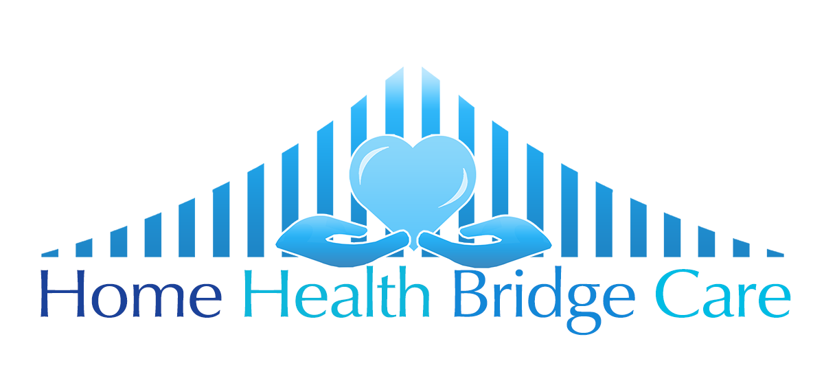
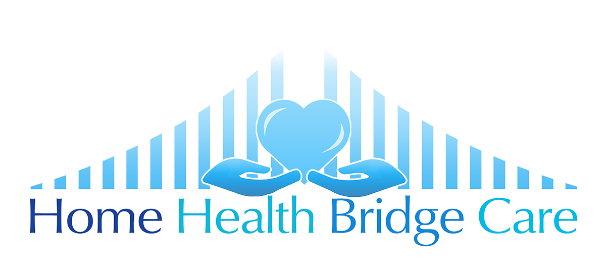
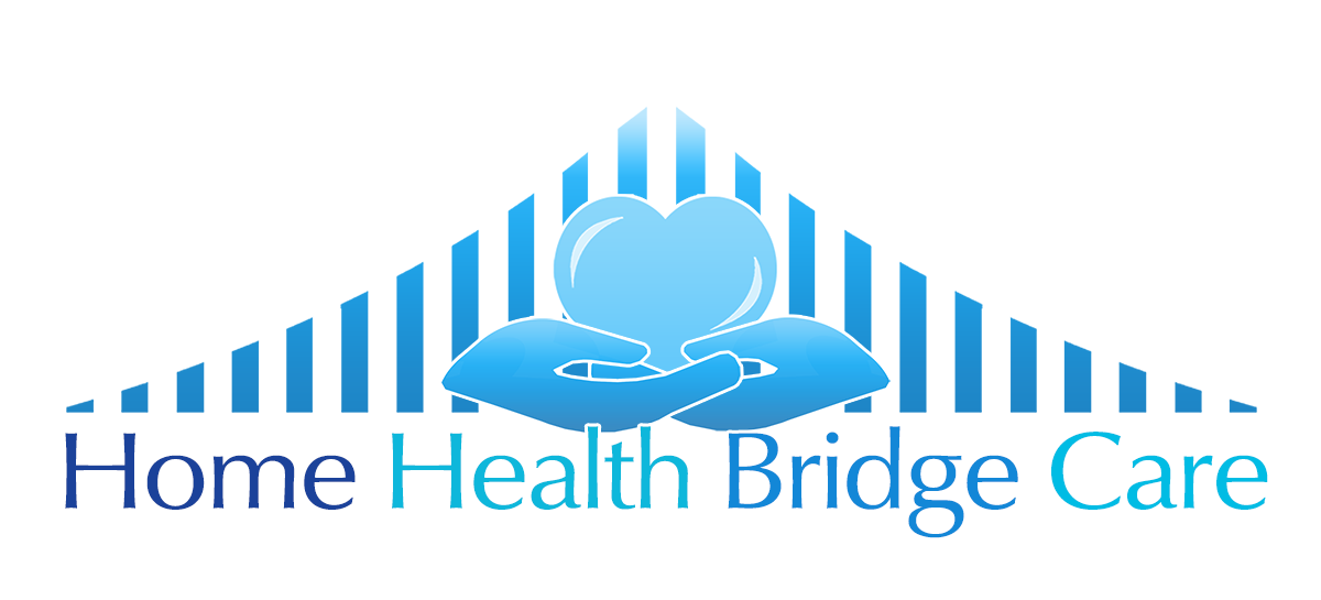
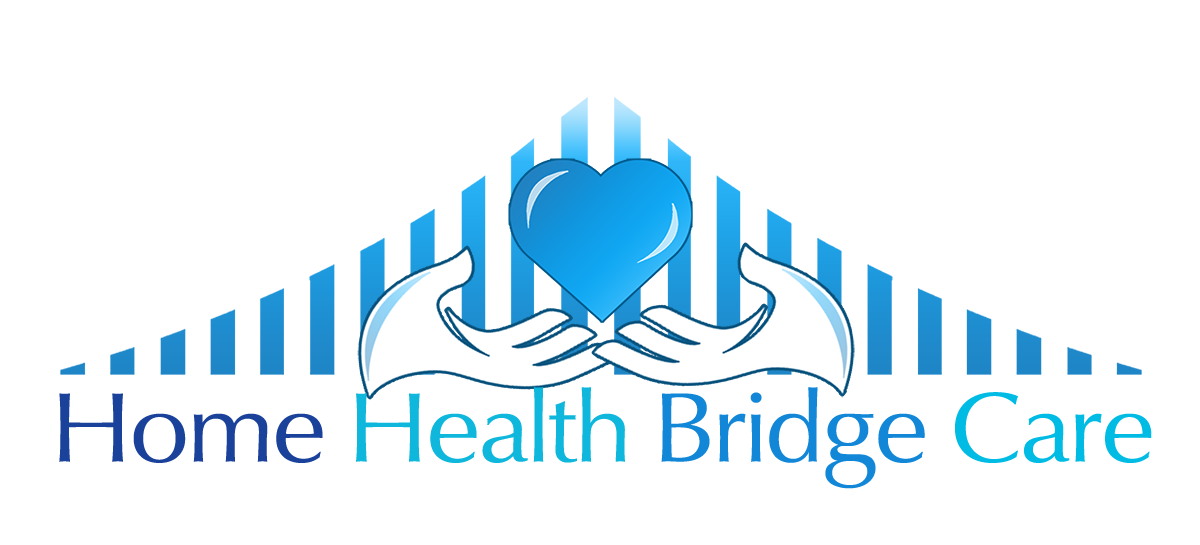
After the client chose the direction she wanted to follow I did these refinements. You can see I discarded all but the one bridge design and basically just different colors, she wanted 3-d look, different hands (she wanted them to look like doves) and just different placement of elements.
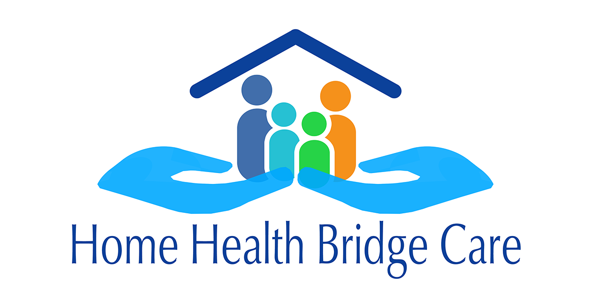
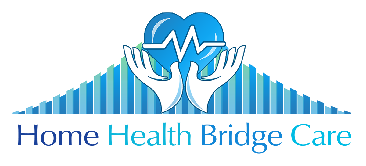
Take three:
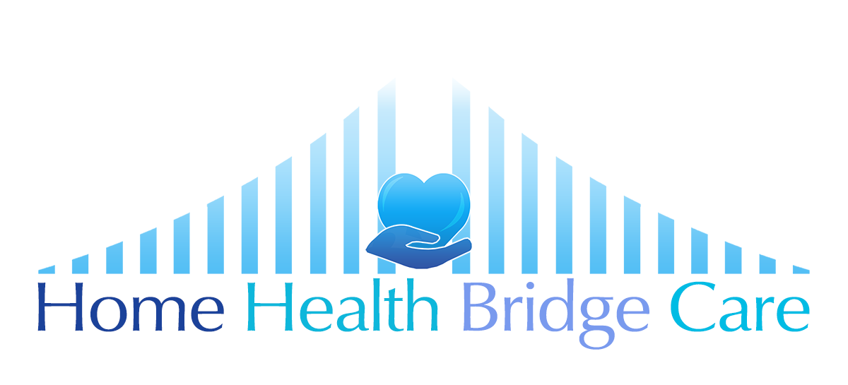
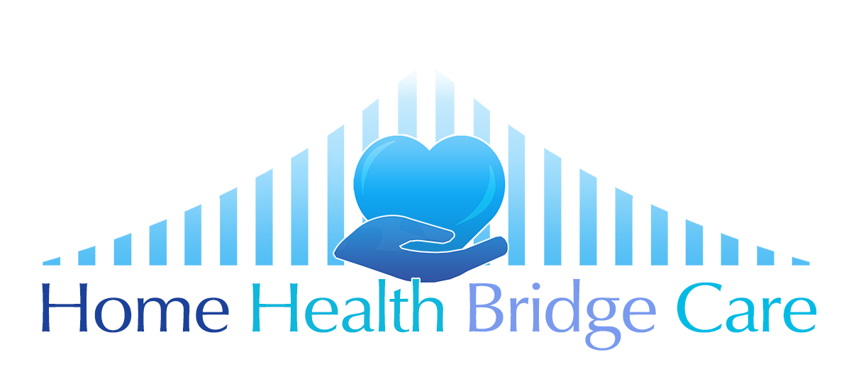
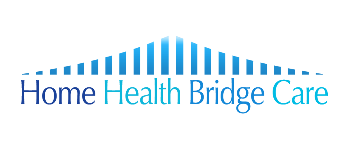
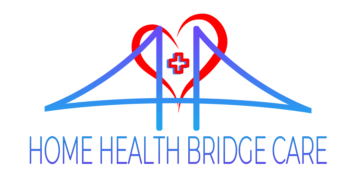
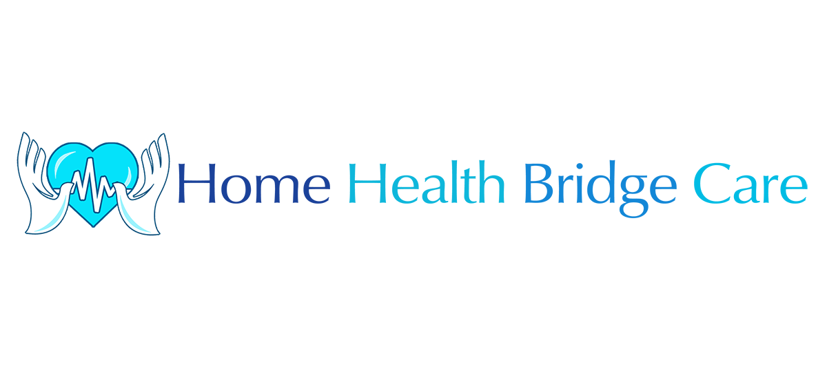
And the last pass and the final choice. Usually it takes 3 passes, if you don’t have something by then the client doesn’t know what they want and you have to get some specific details and elements the definitely know they want nailed down or some people will “know it when they see it” and string you on for countless revisions.